International Myeloma Foundation
A CASE STUDY
"Rhonda Conry has been integral in taking the IMF brand and all its associated brands to new heights in terms of global reach and engagement. Her creative sensibilities and strategic approach have elevated the brand, and she has become a valued member of our team."
— Jason London, Sr. Manager, Marketing & Communications, International Myeloma Foundation
Brand Strategy • Corporate Identity • Sub-Brand System • Print Collateral • Social Media • Annual Reports • Event Signage & Materials
A Foundation Reborn
The International Myeloma Foundation is one of the world's leading cancer research and patient advocacy organizations, dedicated to improving the quality of life for myeloma patients while working toward prevention and a cure. With a global membership of over 525,000 people across 140 countries, the IMF's reach is extraordinary. Their brand, when we first met, was not.
The Challenge
The IMF had been doing world-class work for decades, but their visual identity didn't reflect it. The existing logo was flat and generic, more clipart than credibility. Their sub-brands, over 15 of them, had grown organically into an inconsistent collection that bore little relationship to one another. Nothing communicated the sophistication, the urgency, or the global scale of what the organization was actually doing.
The founders were deeply attached to what they had, understandably so. These marks had been with them through the organization's most formative years. The challenge wasn't just design. It was trust, diplomacy, and strategy in equal measure.
The Work
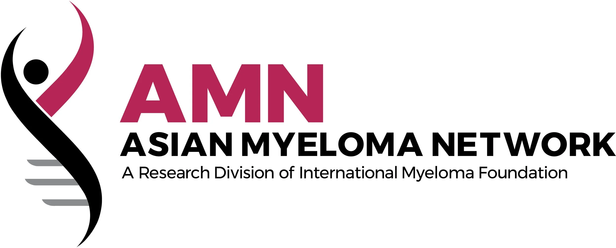
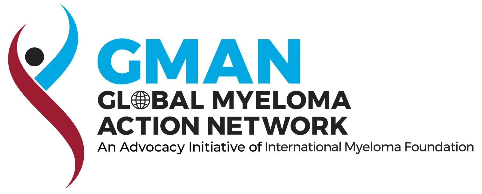
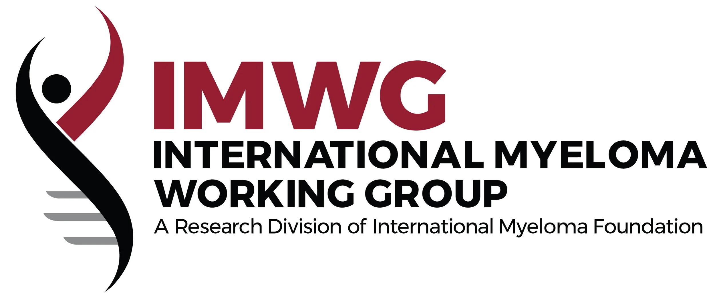
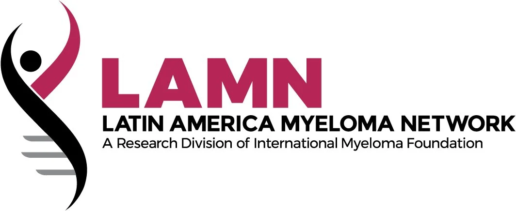
I began with brand strategy, developing a full brand platform that would serve as the foundation for every creative decision that followed. From there, we moved into the primary logo redesign. Through many rounds of exploration and revision, we arrived at a mark that honored the organization's heritage while giving it the gravitas it deserved: a figure in motion, inseparable from the DNA double helix — a quiet, powerful symbol of research, humanity, and hope. The crimson palette carried forward, now refined and purposeful.
Once the primary identity was locked, I systematically redesigned all 15+ sub-brands — bringing them into a cohesive family that felt unified, professional, and built to scale.
The scope grew to encompass every brand touchpoint:
Full corporate identity system and brand standards
15+ sub-brand redesigns
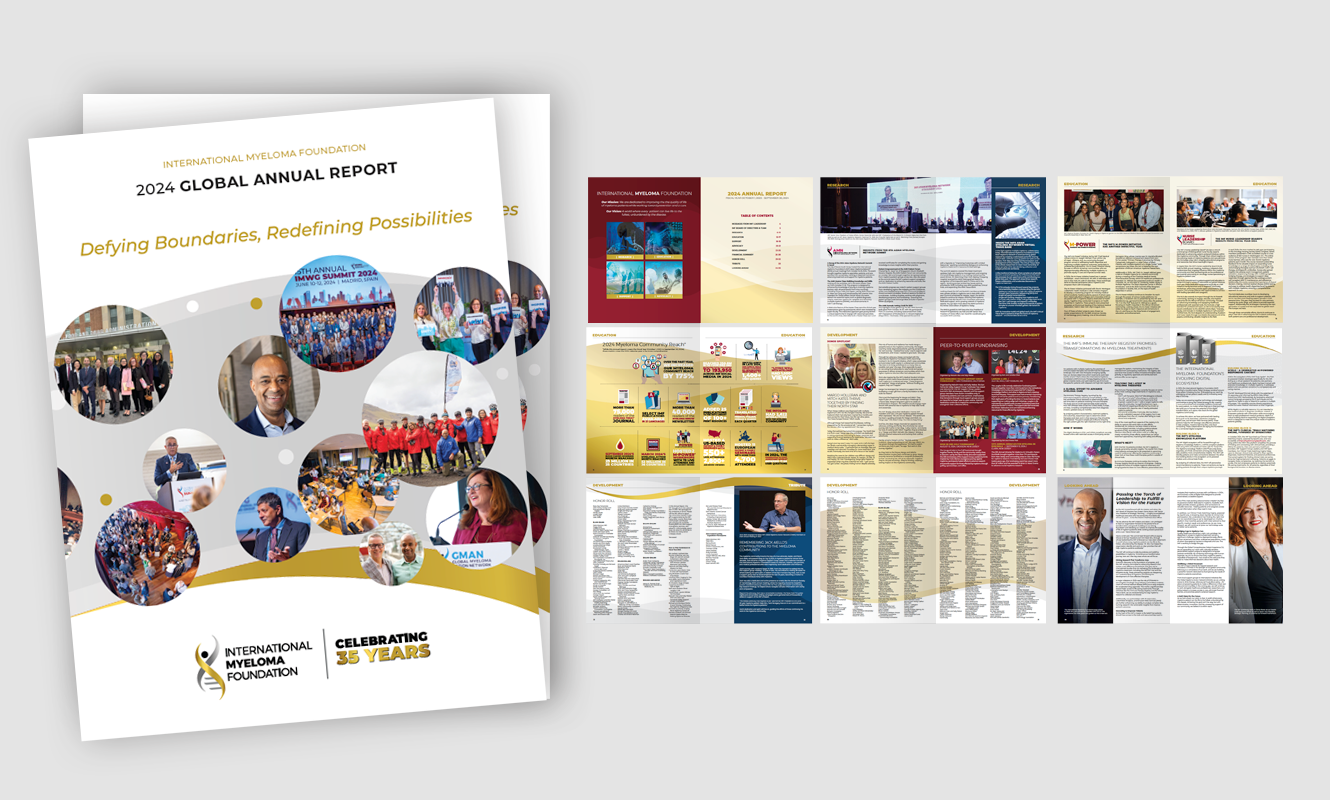
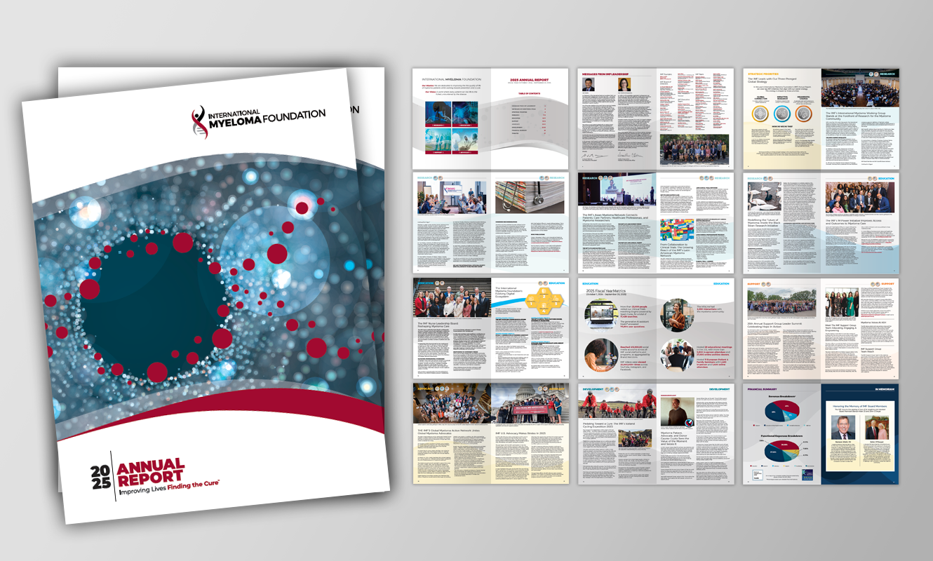
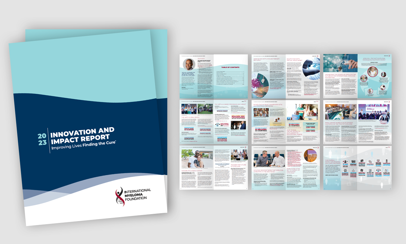
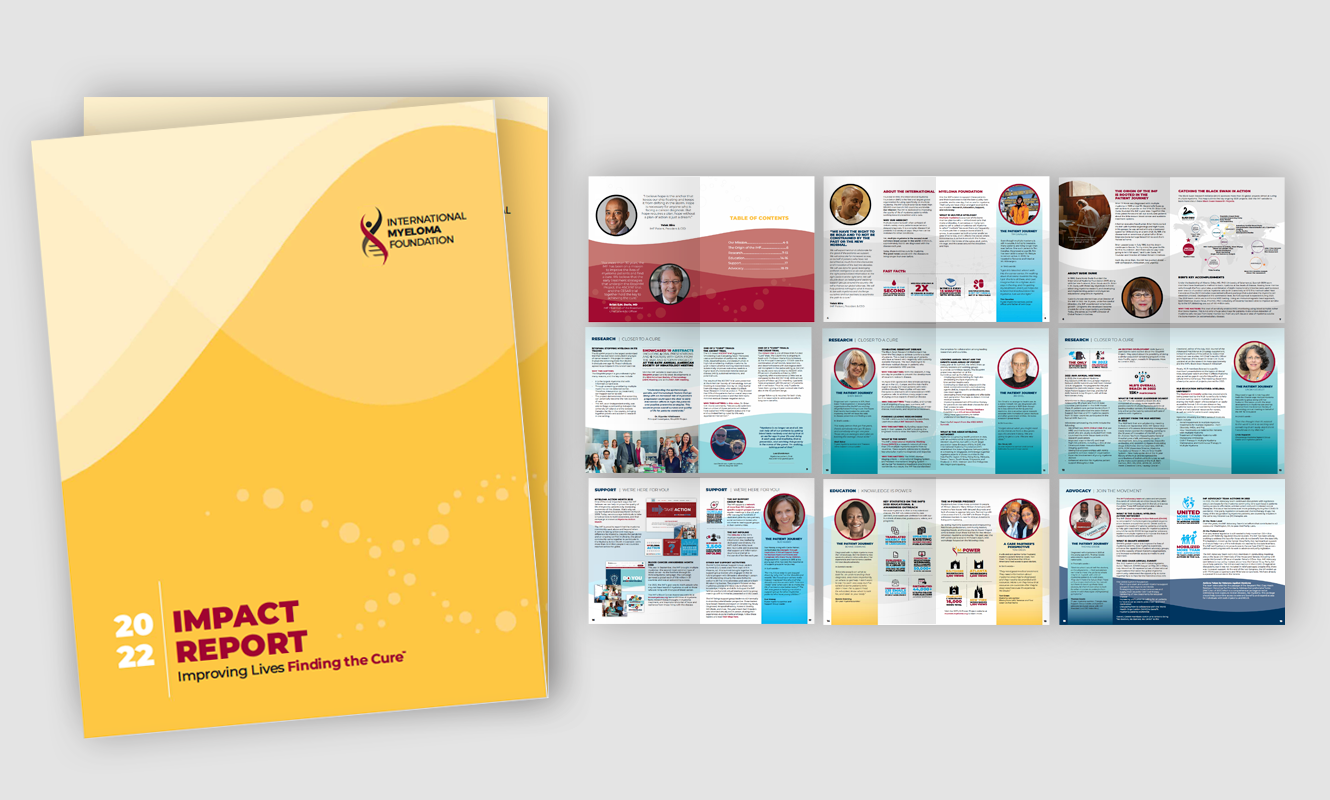
Annual reports
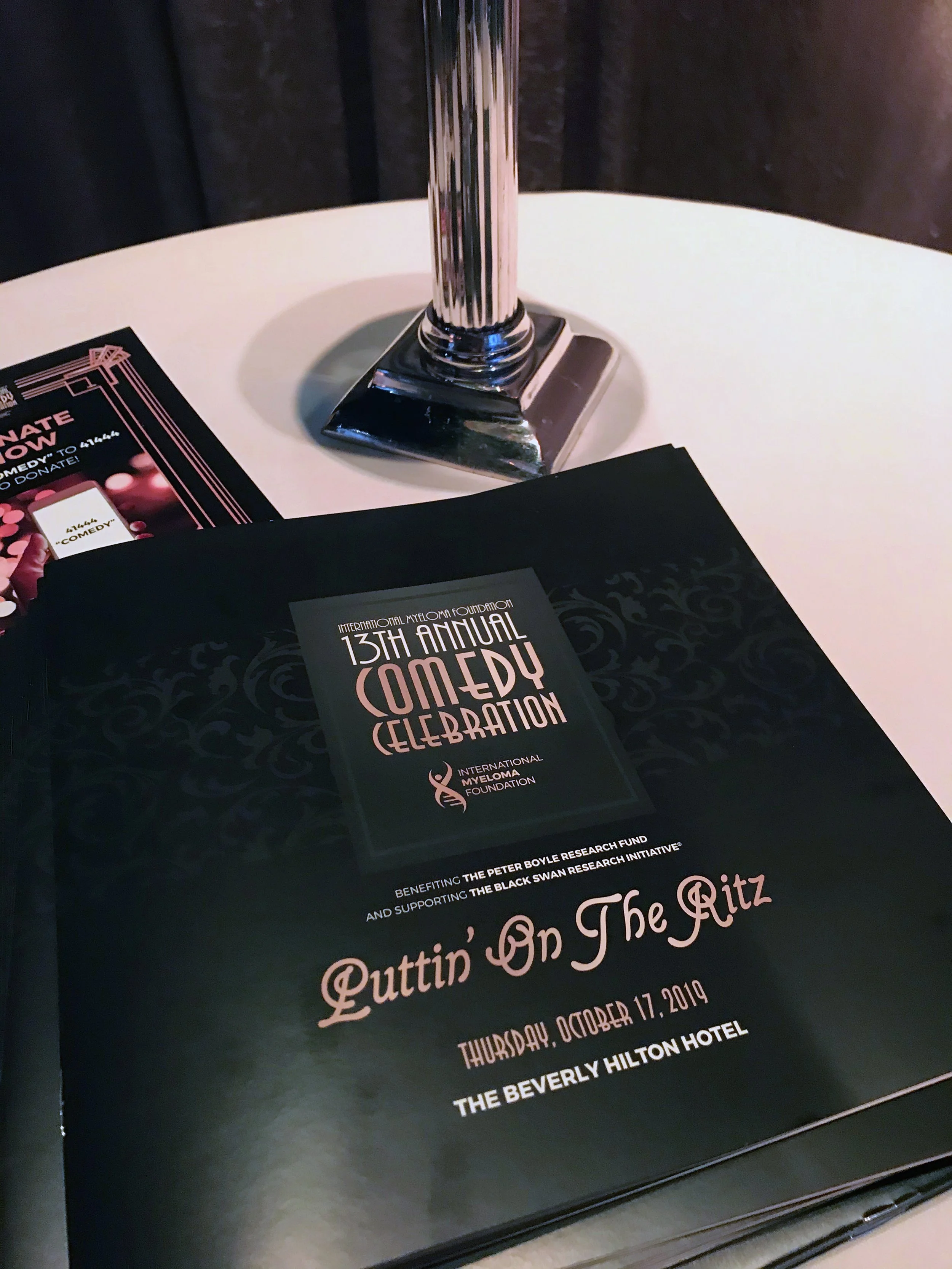
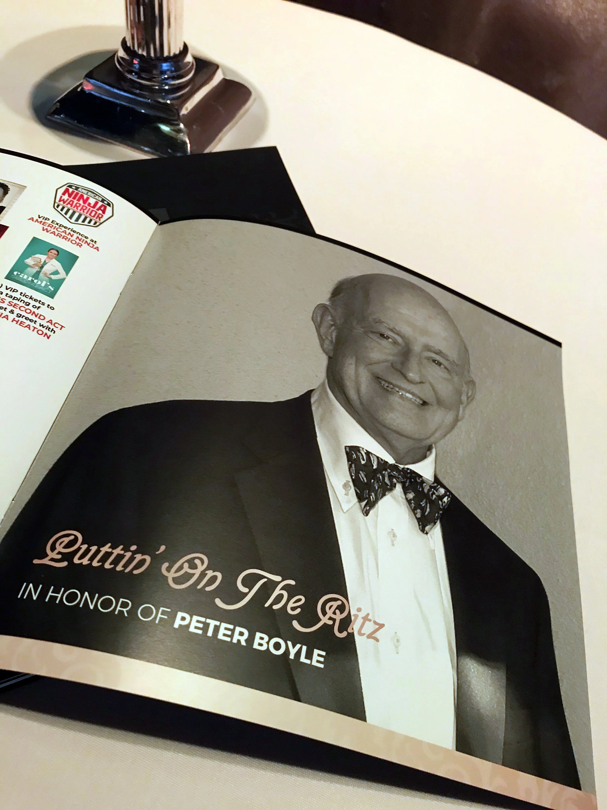
Print collateral and corporate documents
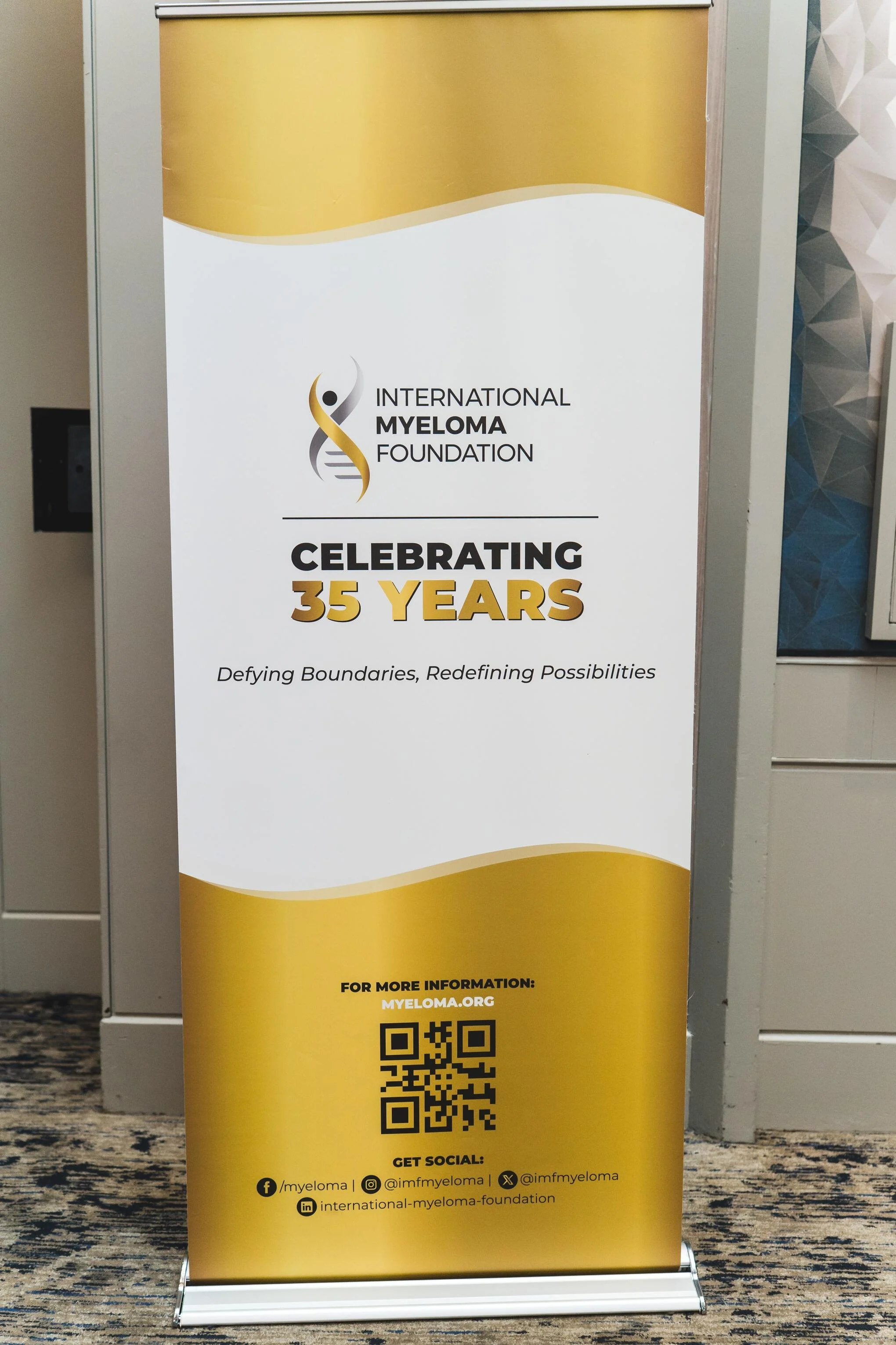
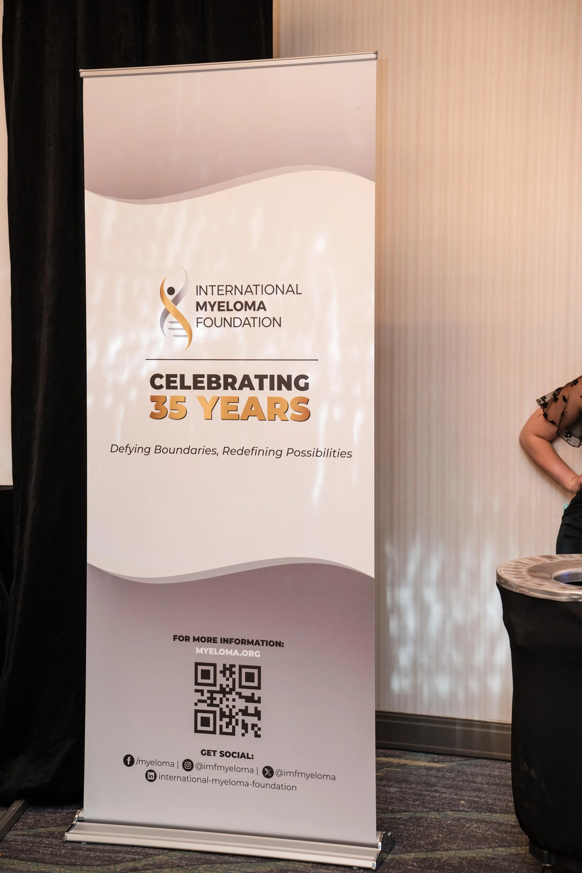
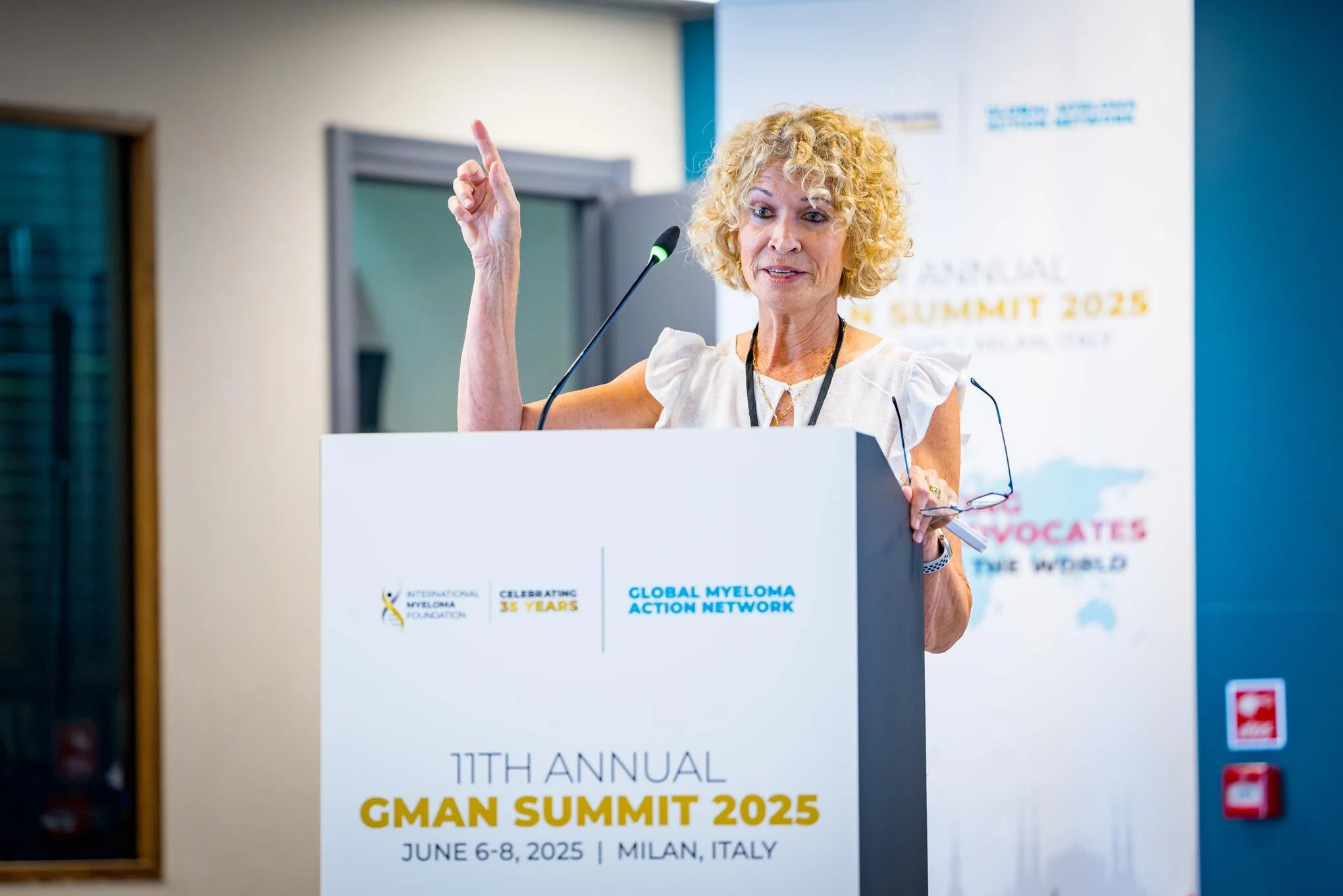
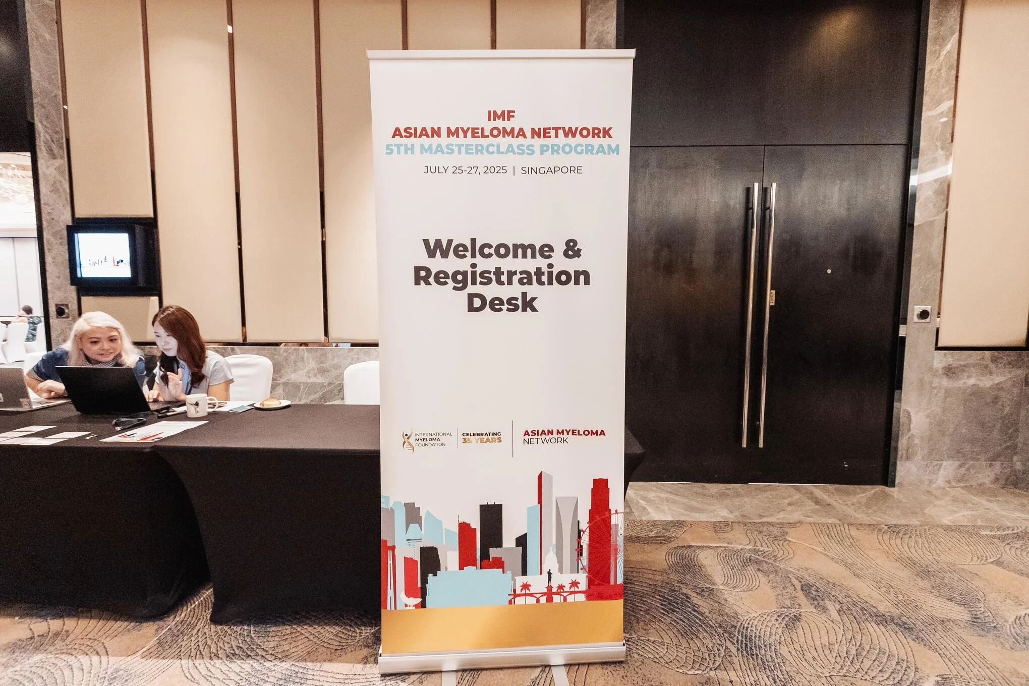
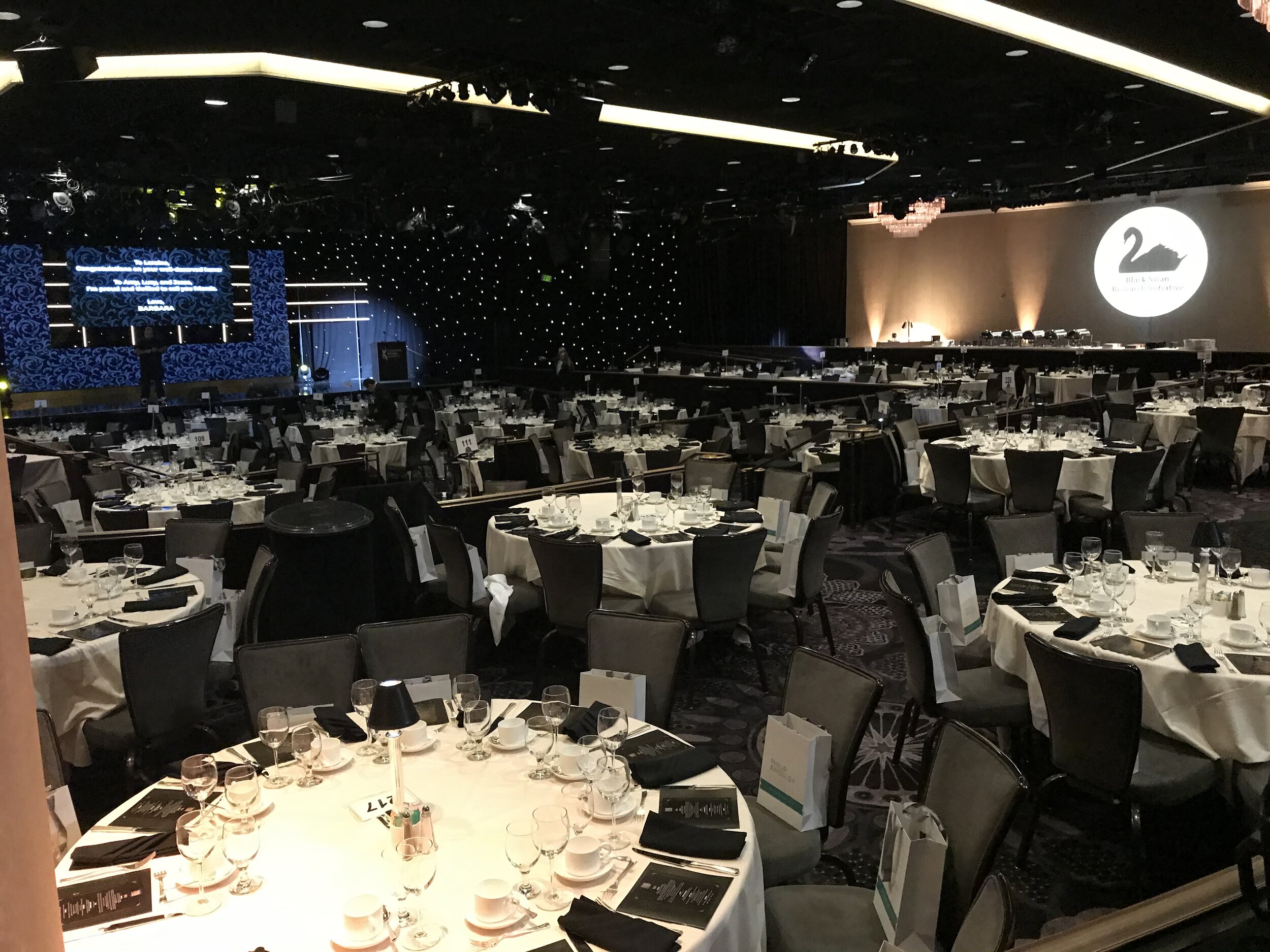
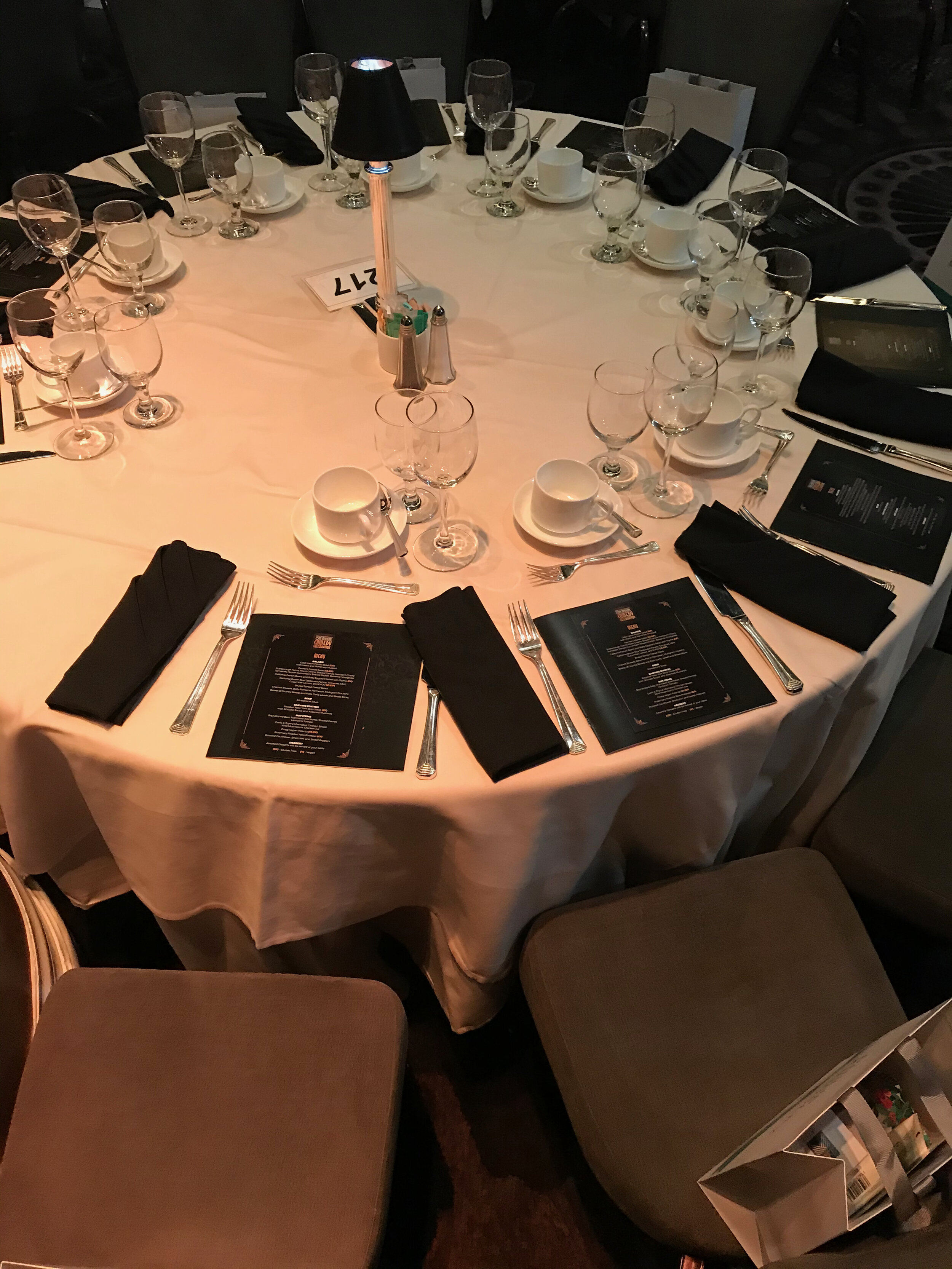
Event signage and environmental graphics
Trade show and conference materials
Social media campaigns
Ongoing brand guardianship across the entire organization
The Partnership
This wasn't a project with a start and end date. Over nine years, I served as the IMF's embedded Creative Director on contract — the person they called for everything brand and design related. I sat inside their team, understood their culture, advocated for their brand, and grew alongside them. It's the kind of working relationship I value most: long, deep, and built on genuine trust.
The Outcome
Over nine years, every measurable marker moved in the right direction. Social reach grew into the millions. Print materials were elevated — polished, purposeful, and well-received across the organization's global network. Events became more professional and cohesive. Fundraising improved.
But the most meaningful shift was harder to measure and impossible to miss: the IMF became an organization that people wanted to trust, engage with, and give to. The brand finally matched the mission.
Brand Strategy, Logo Re-design
Sub-brand Re-design

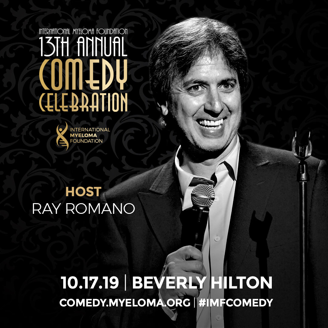
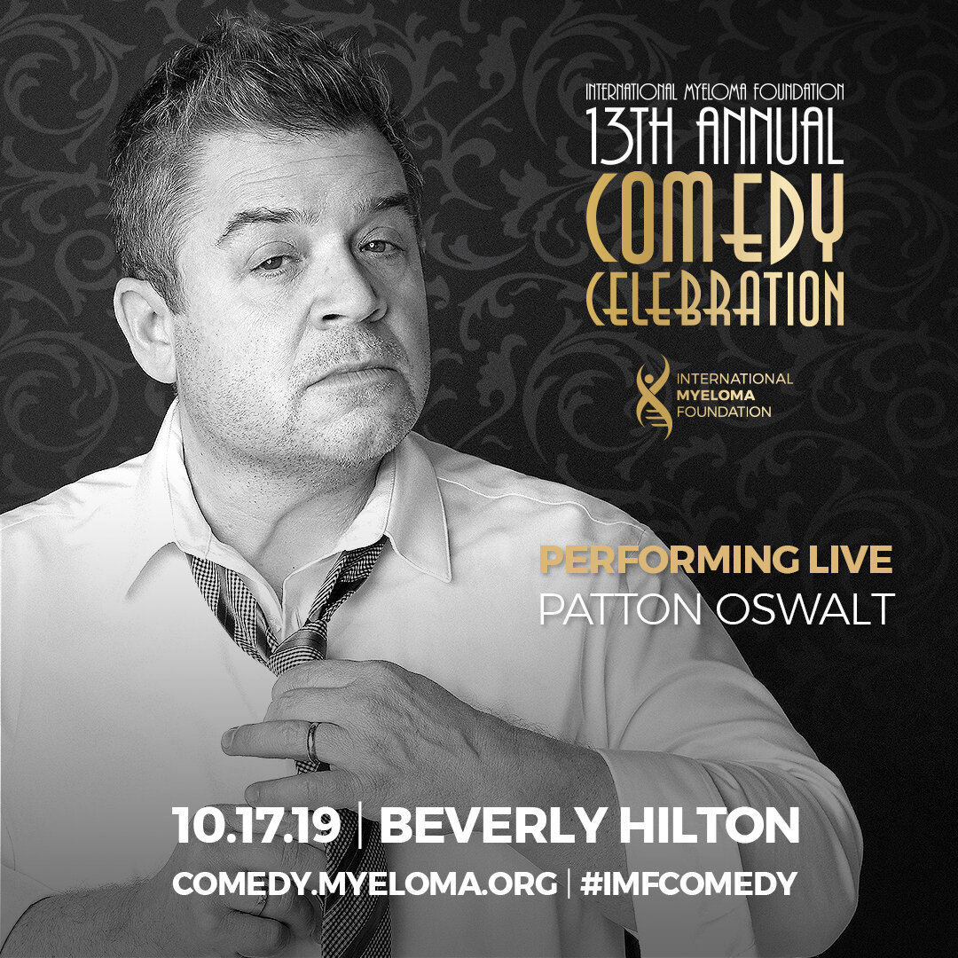
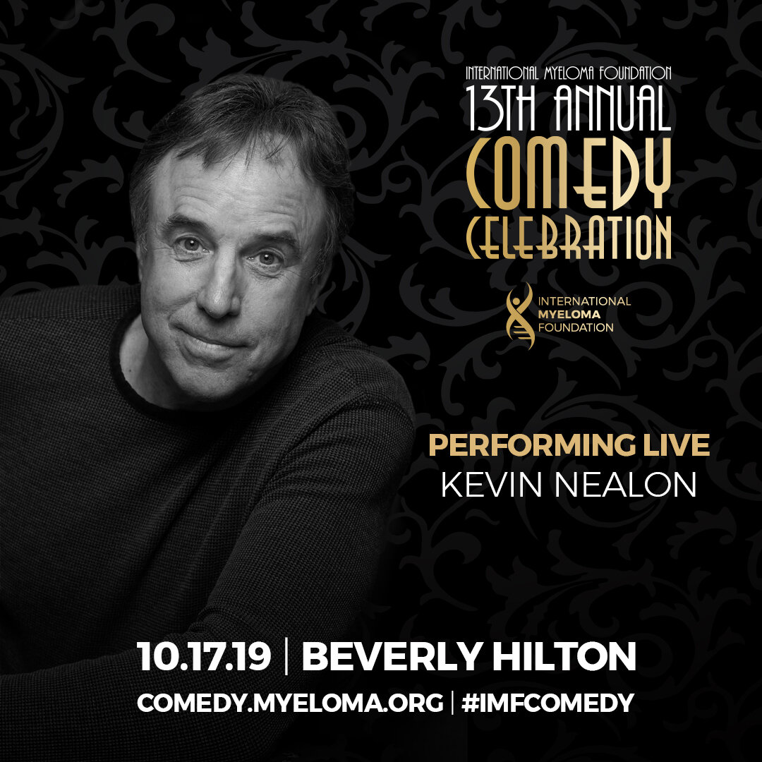
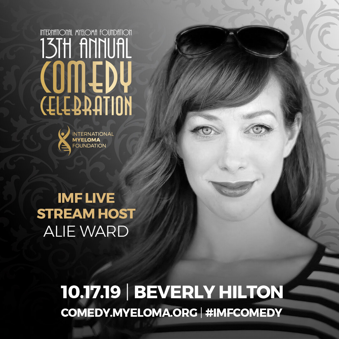
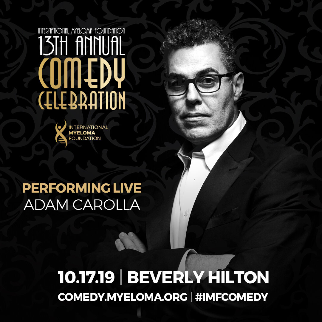
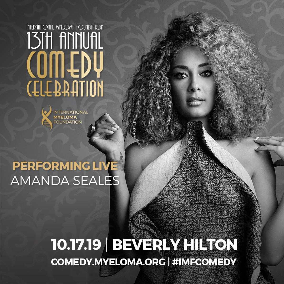
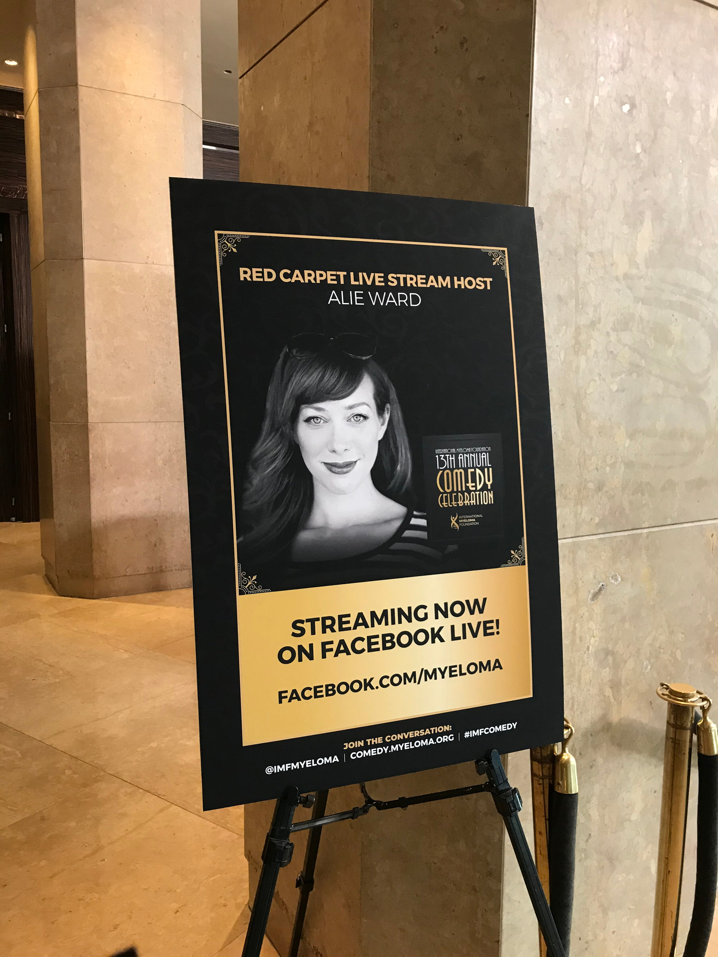
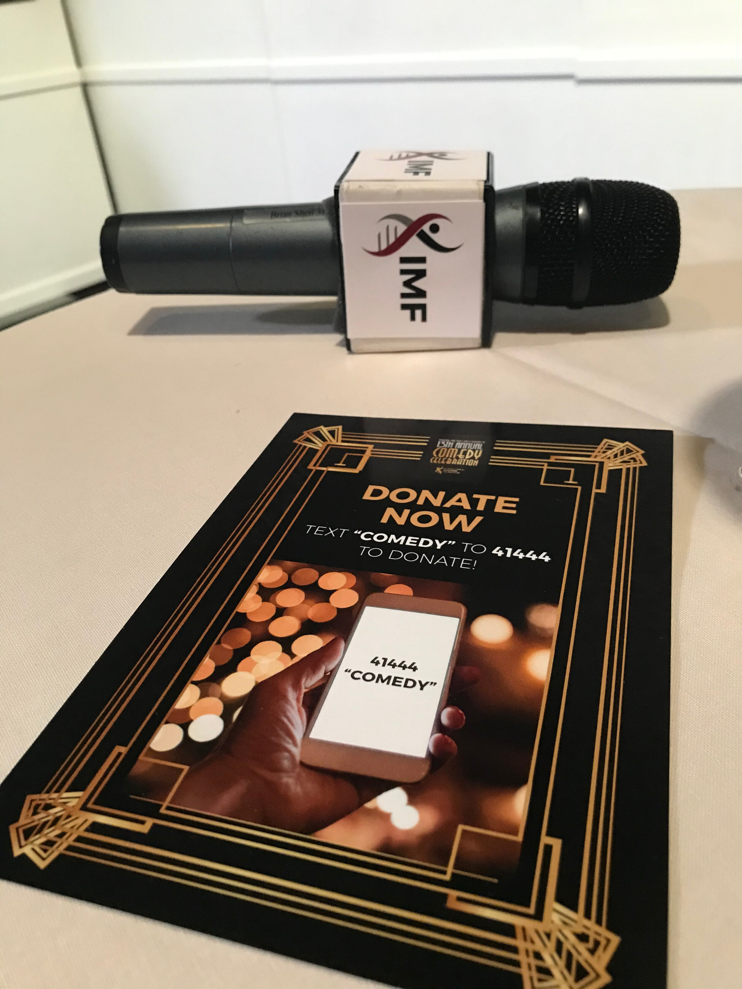
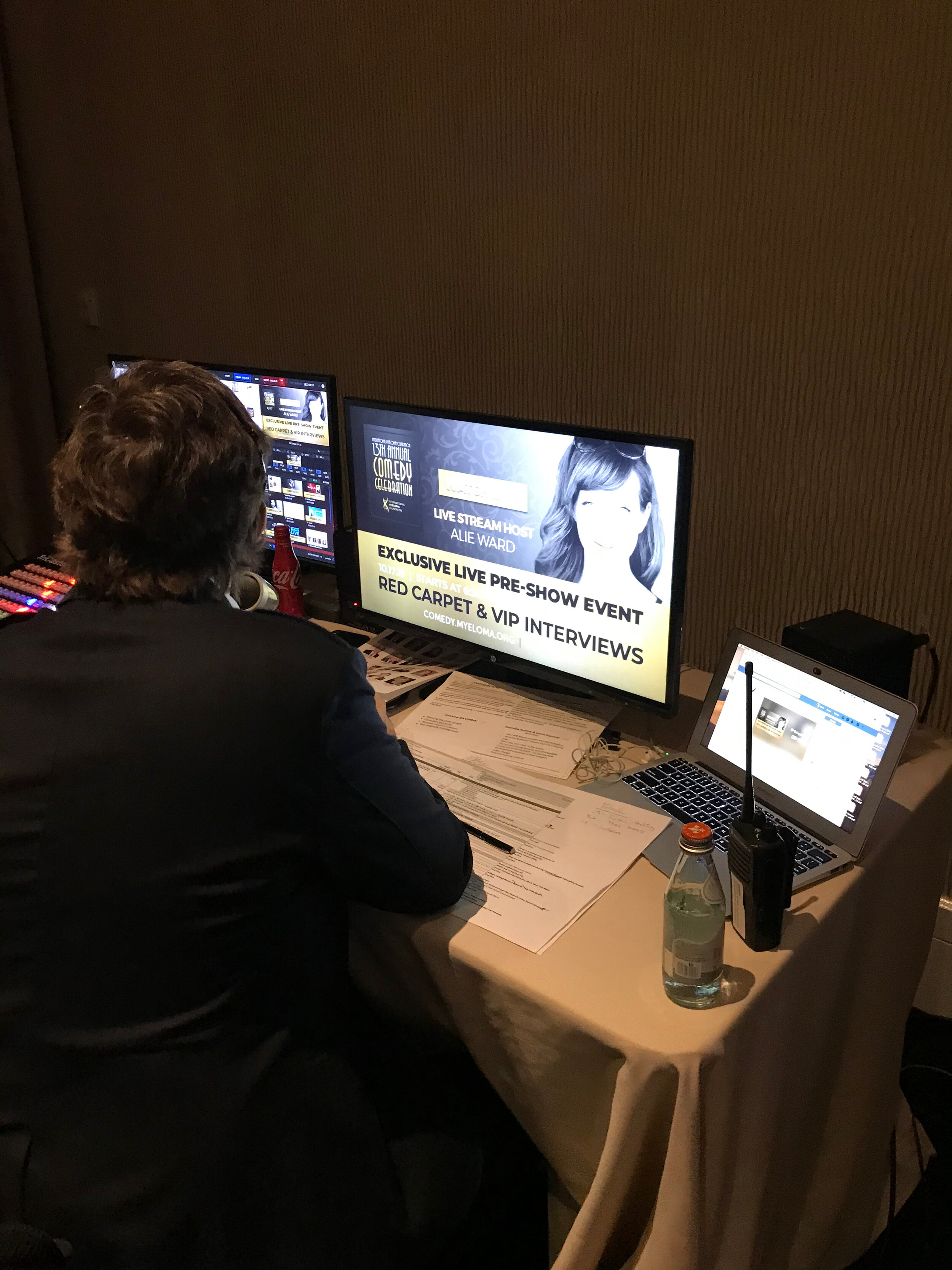
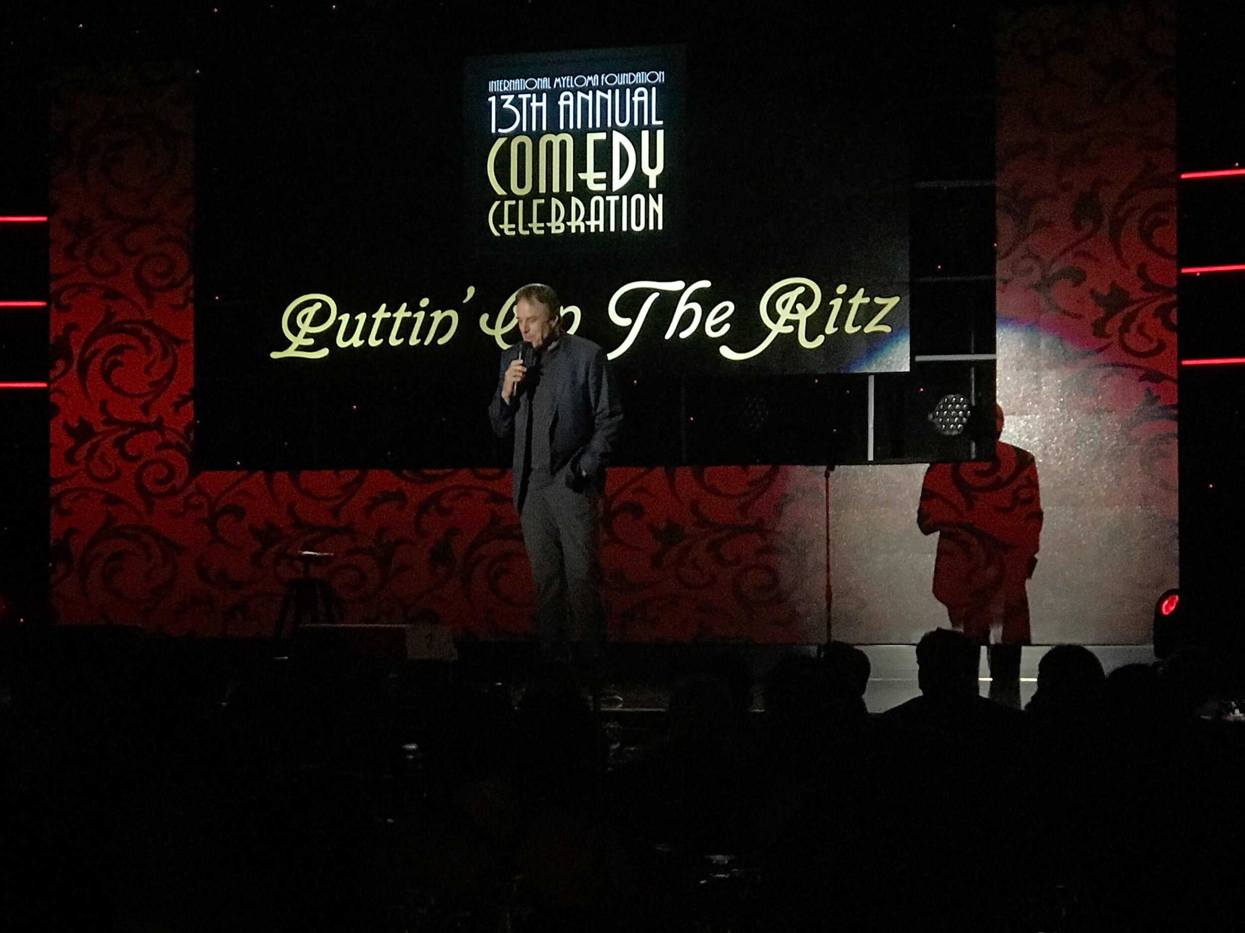
Annual Fundraising Event


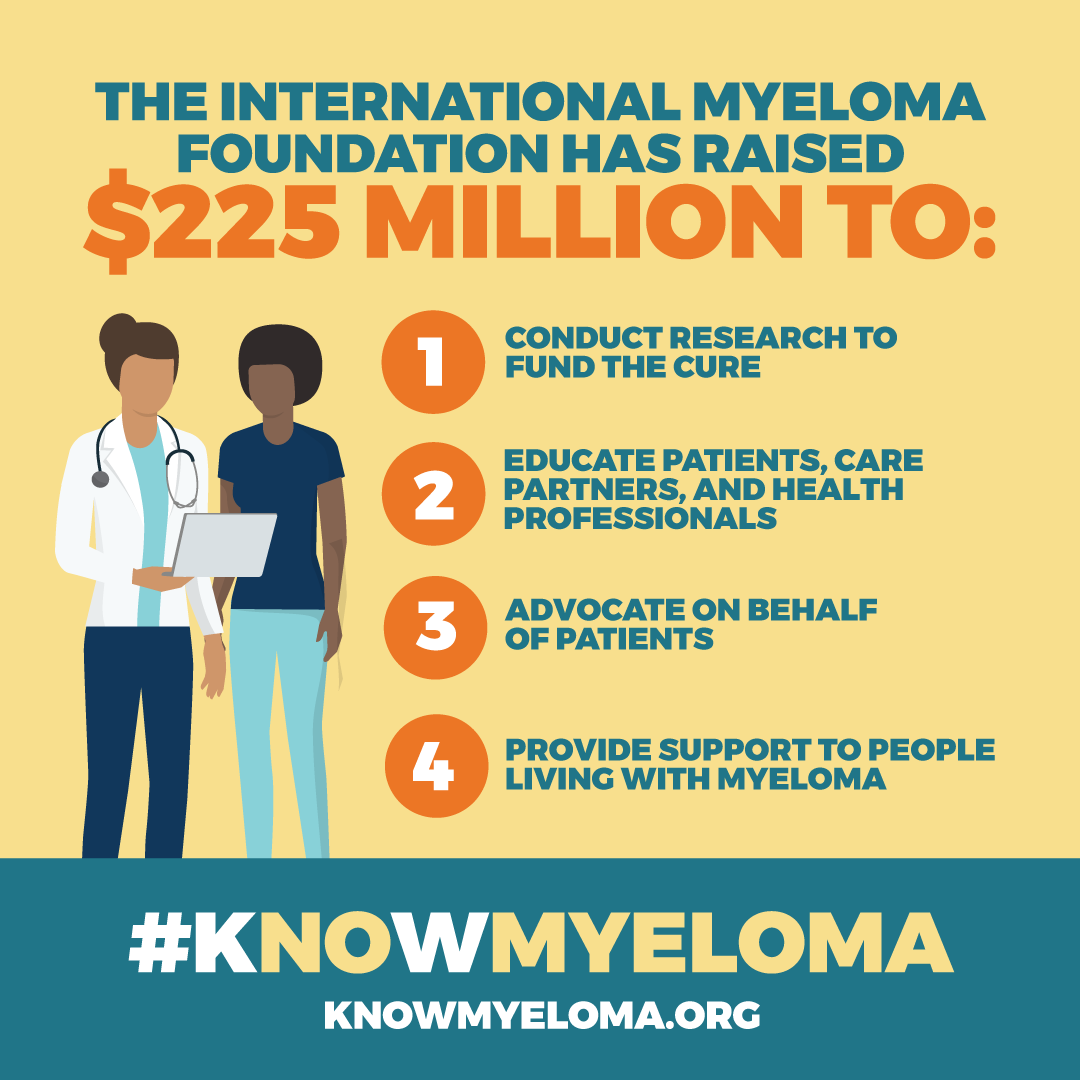
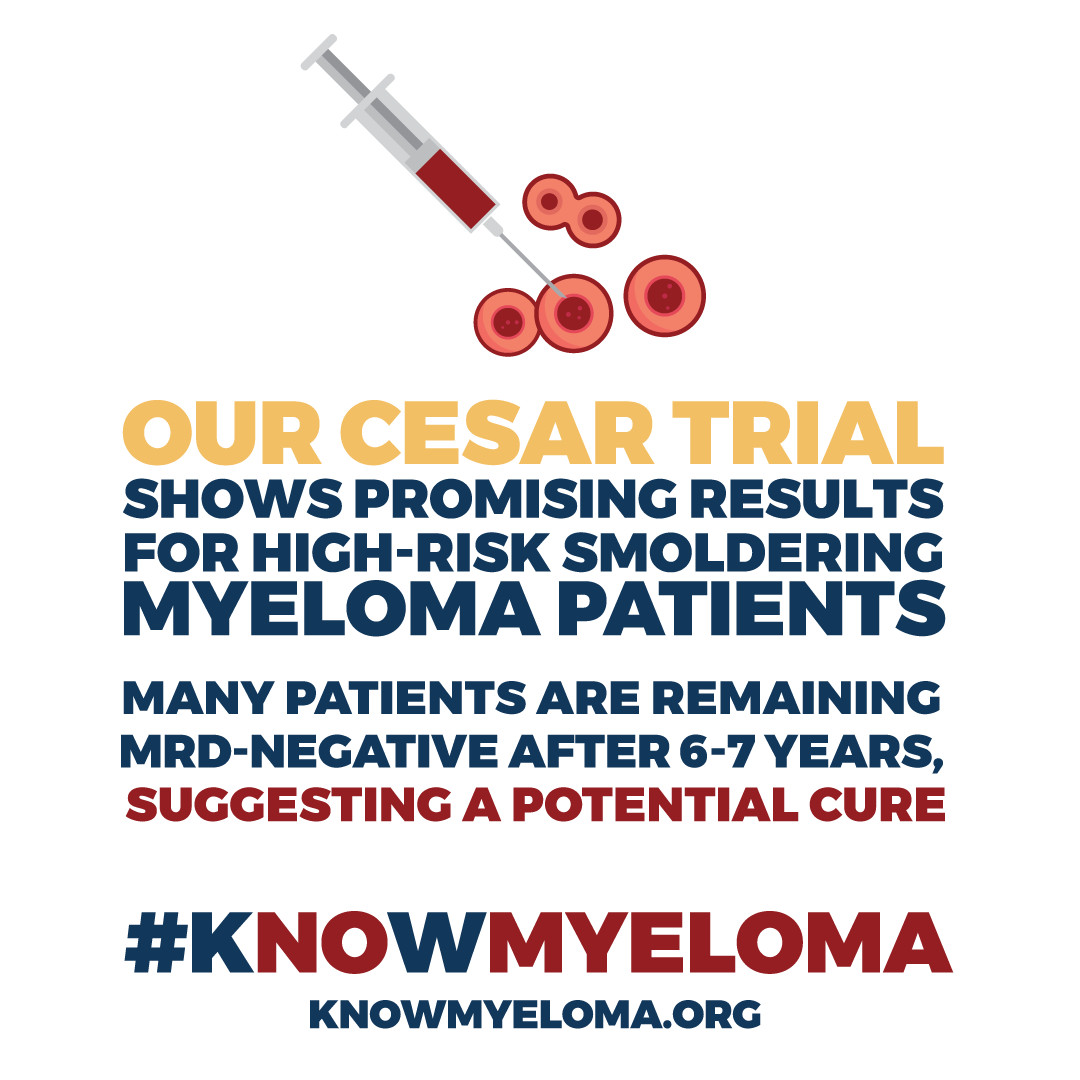
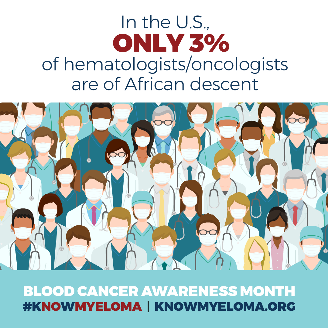
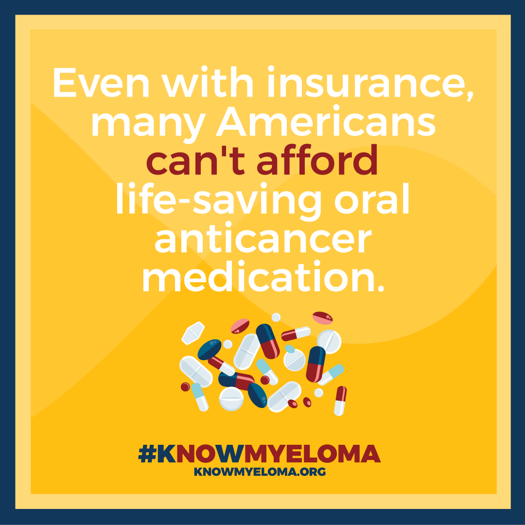
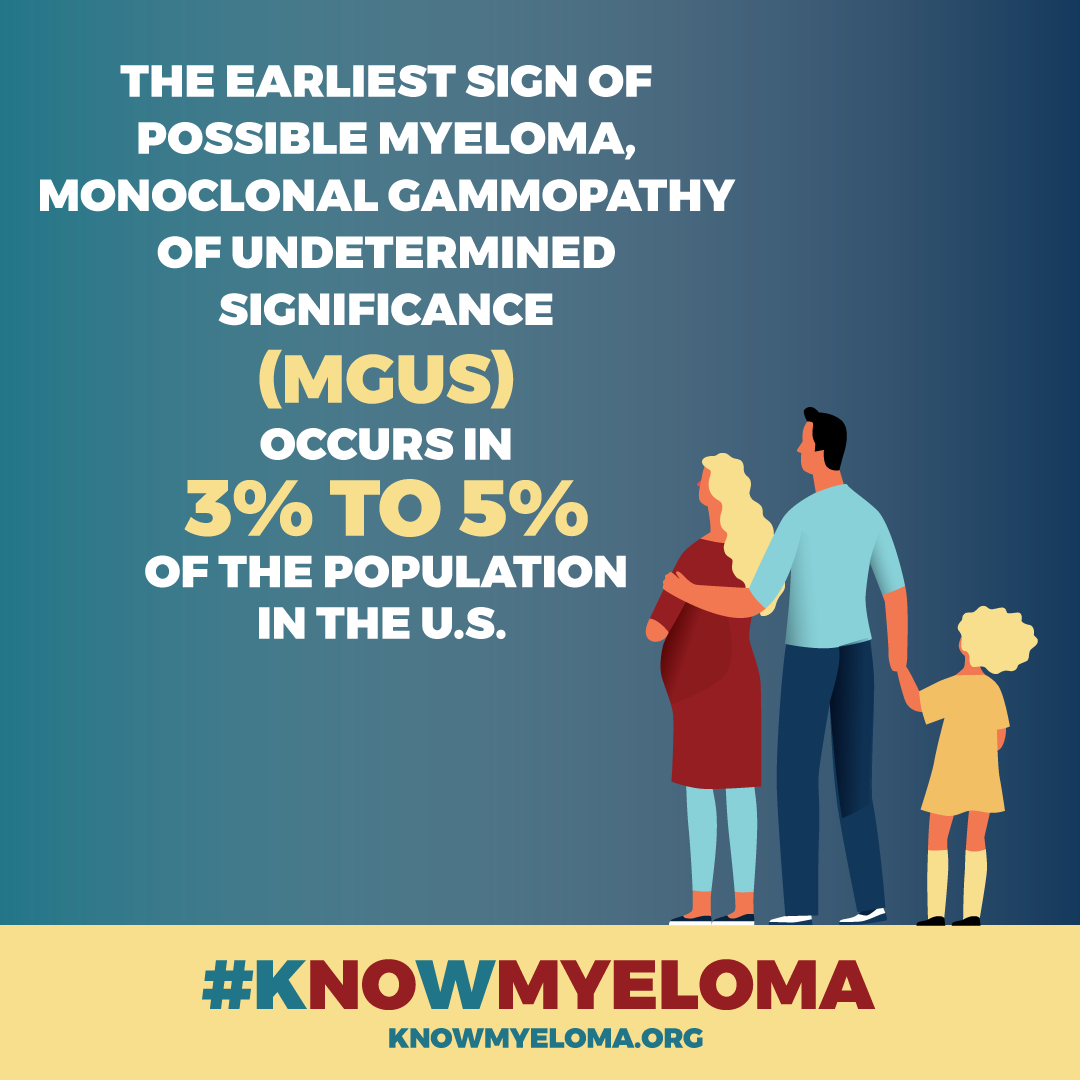
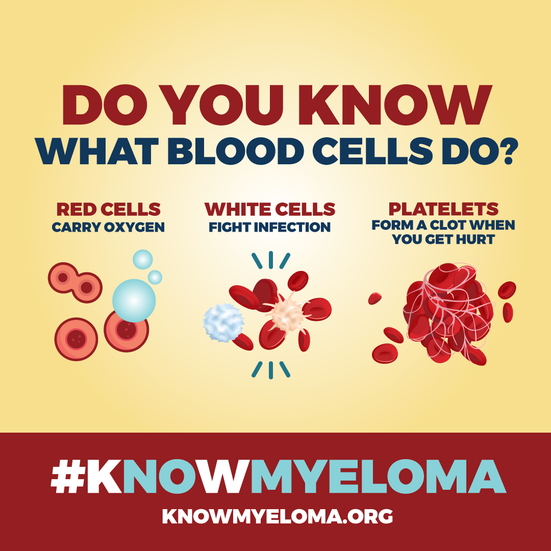
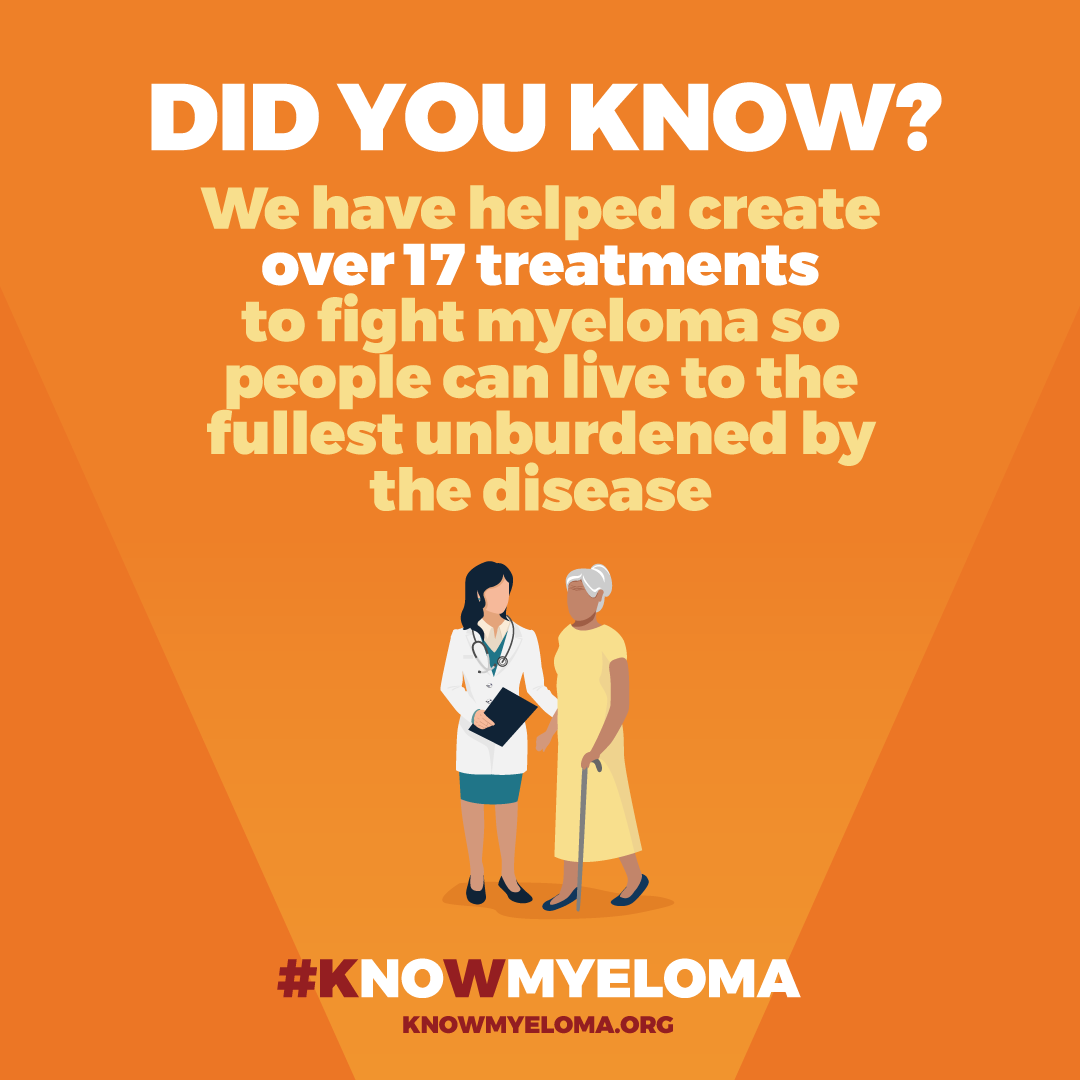
BCAM - Blood Cancer Awareness Month - #KnowMyeloma Social Media Campaign
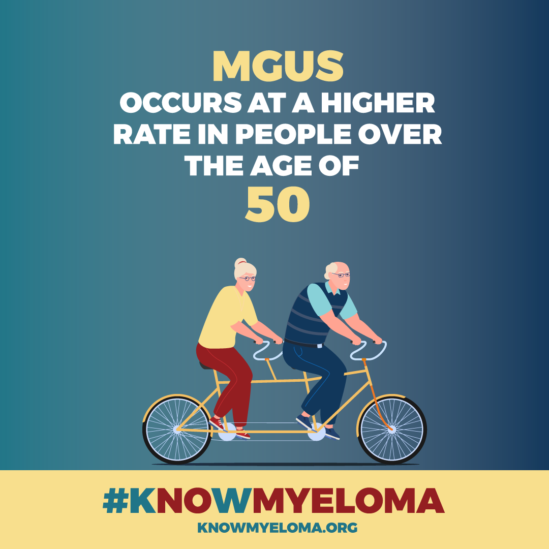
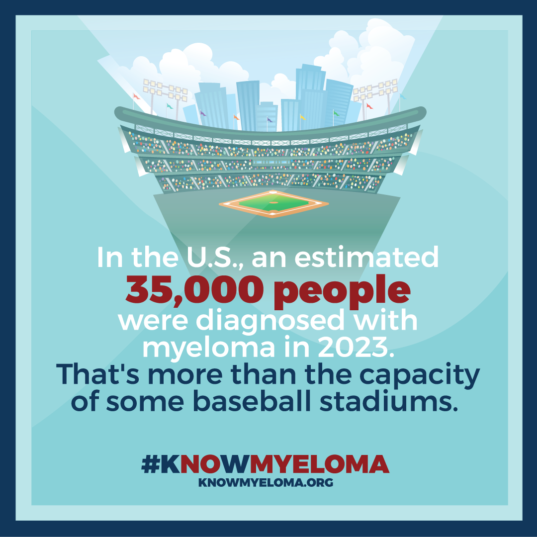
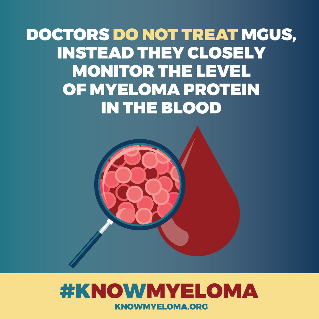
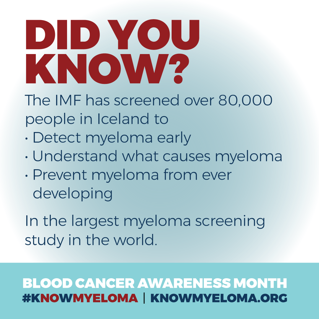
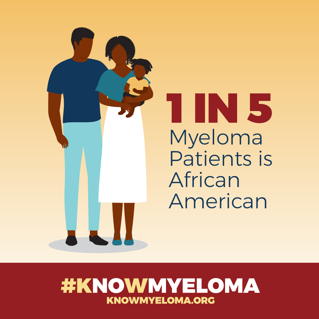
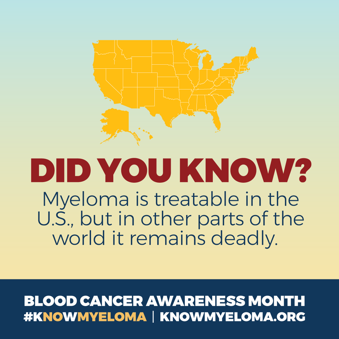
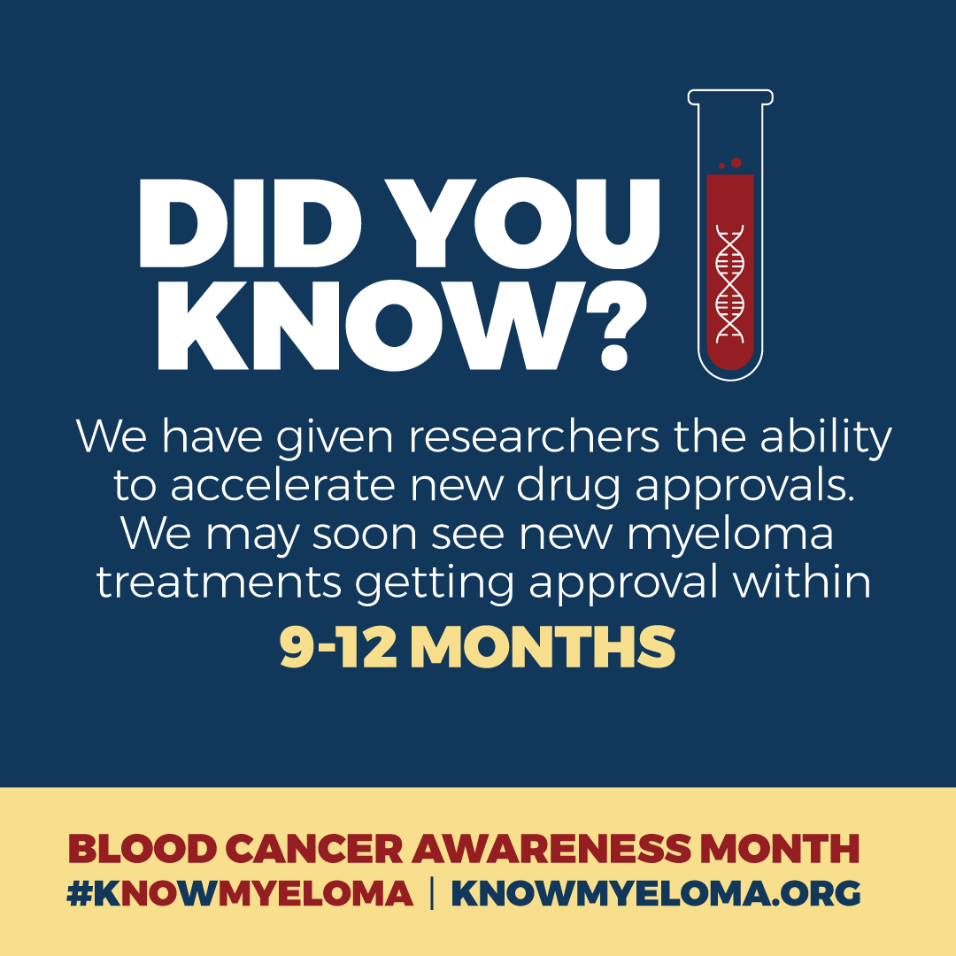
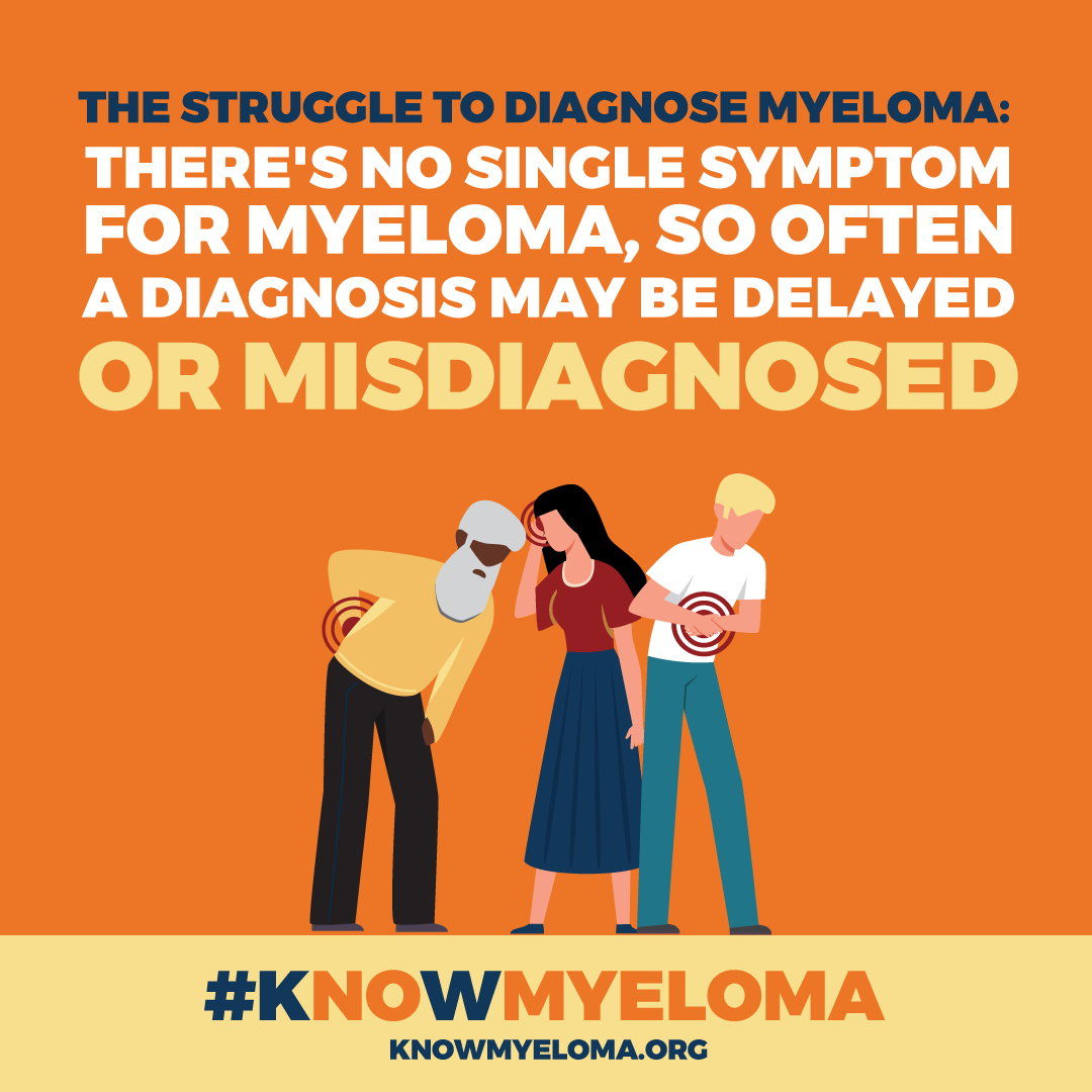
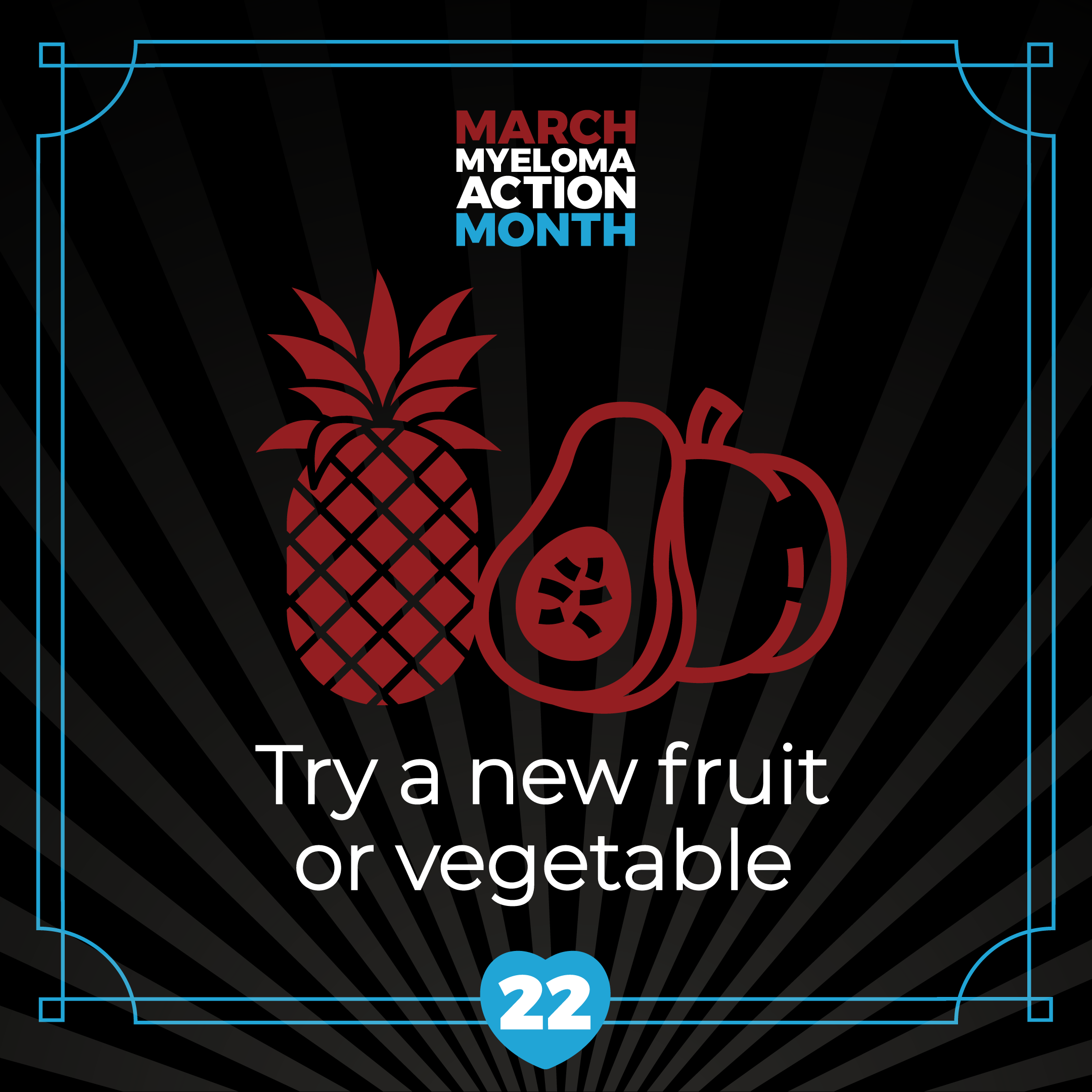
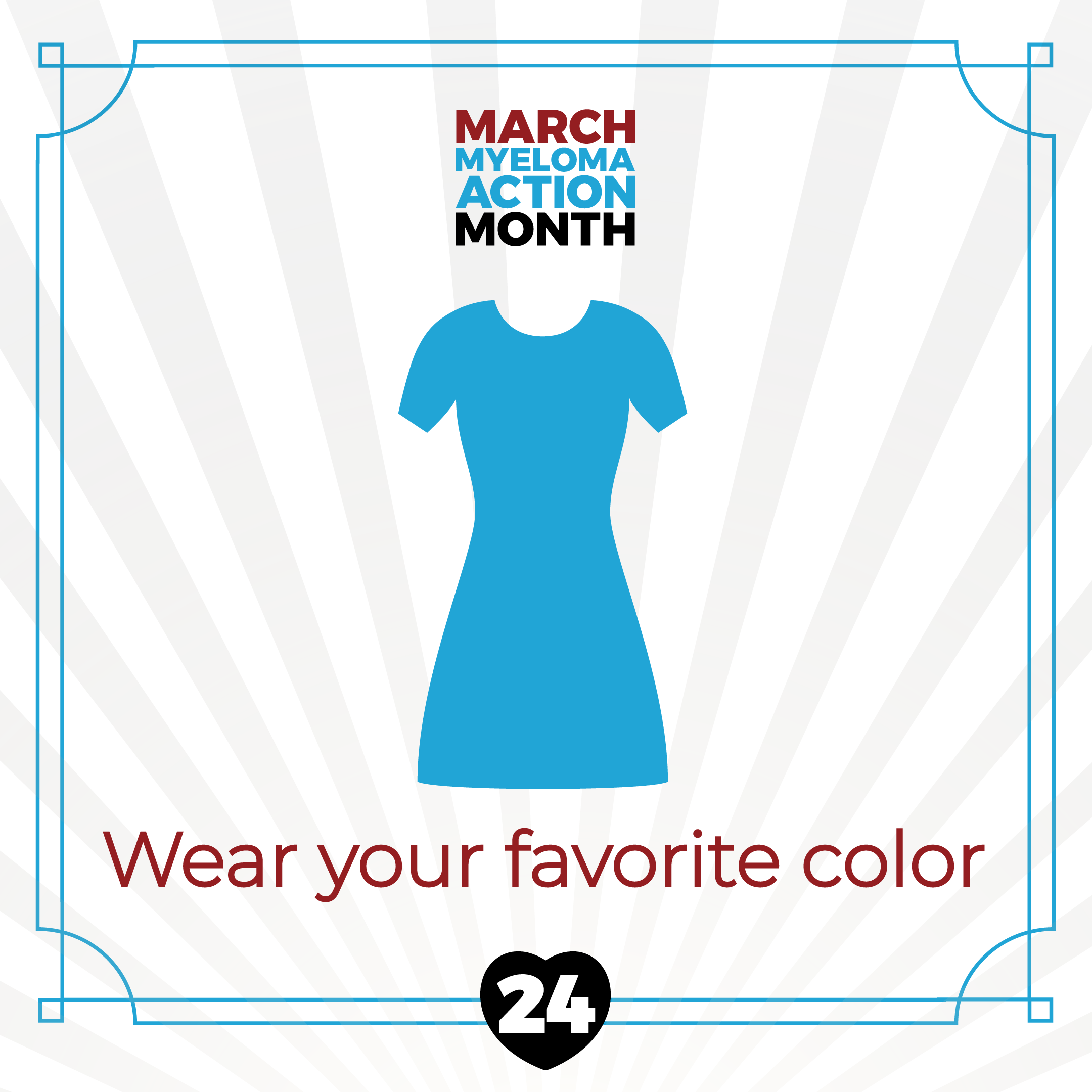
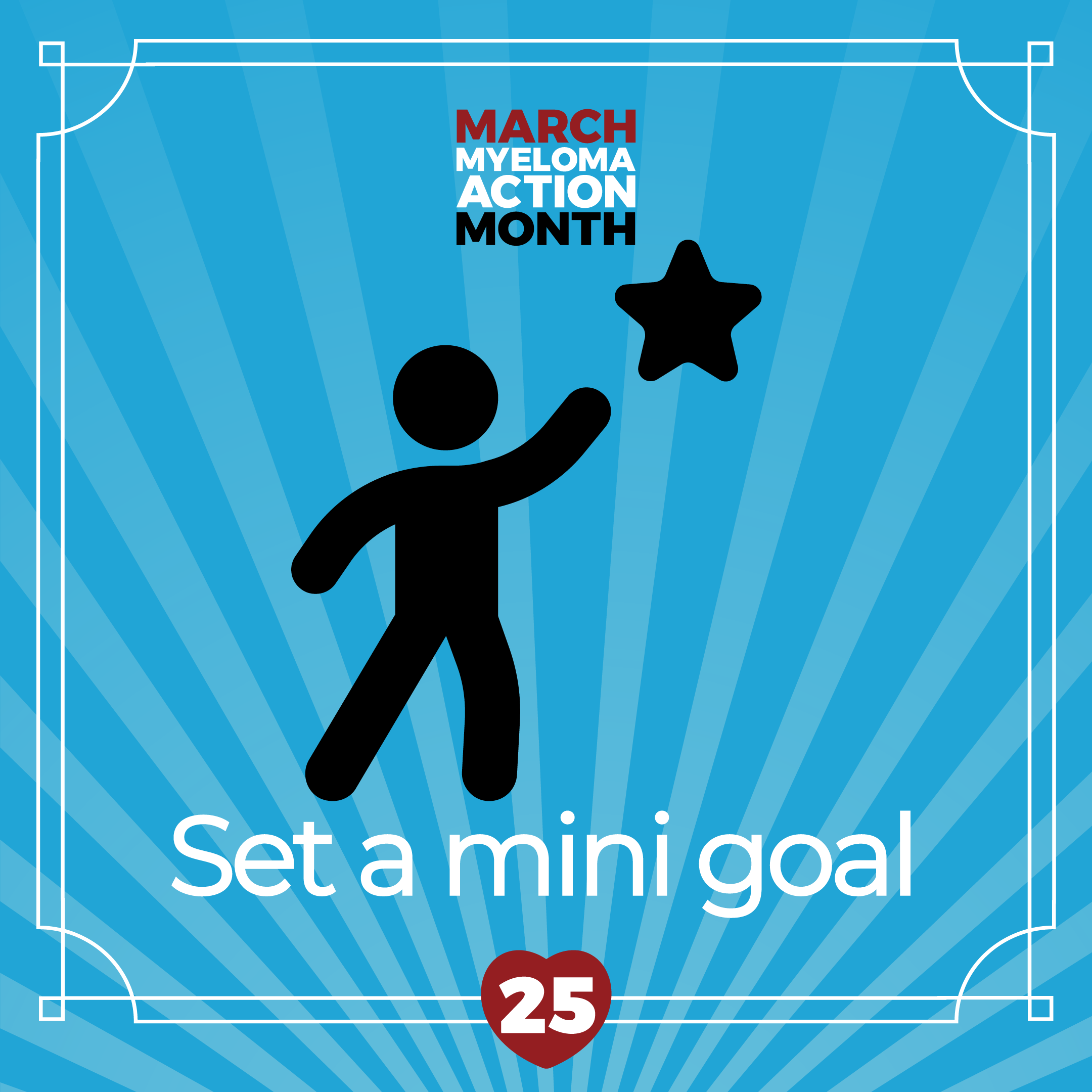
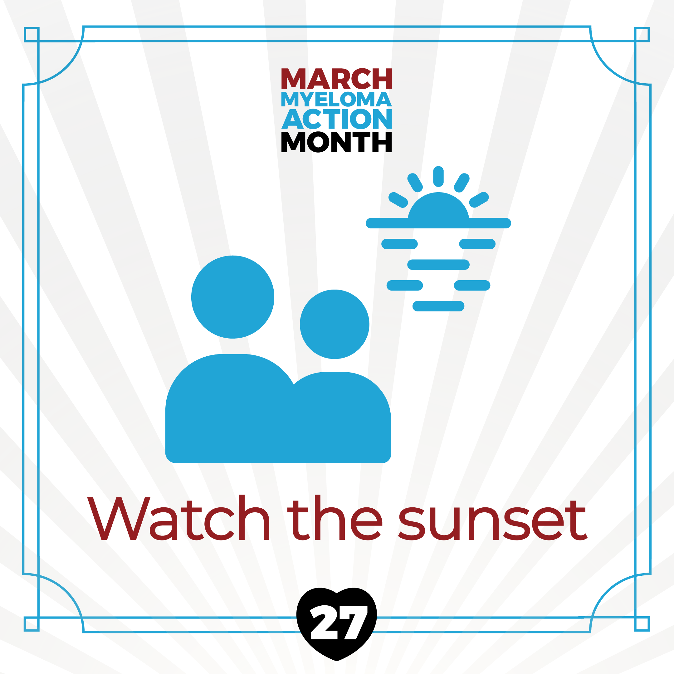
MAM - Myeloma Action Month - 31 Days of Resilience Social Media Campaign
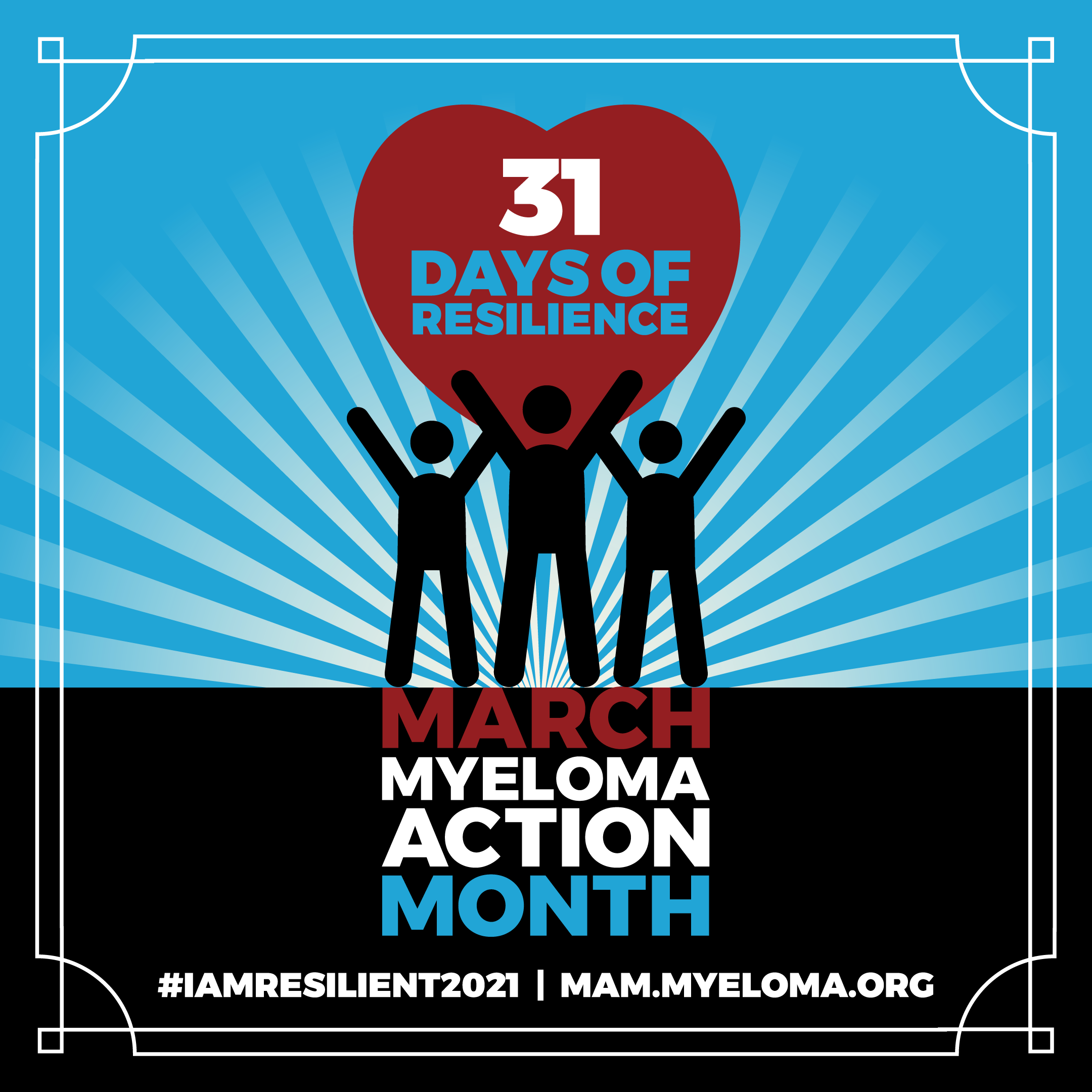


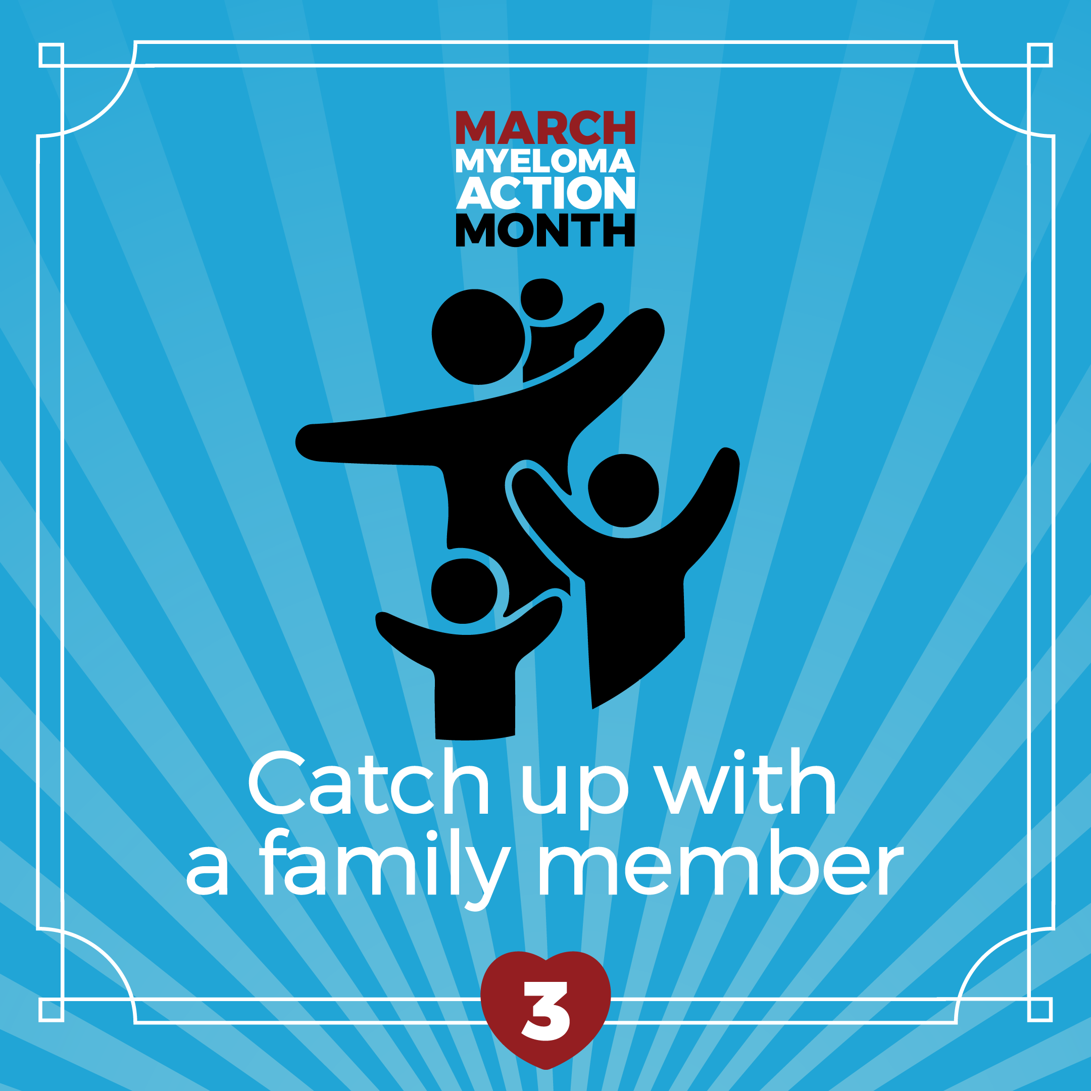








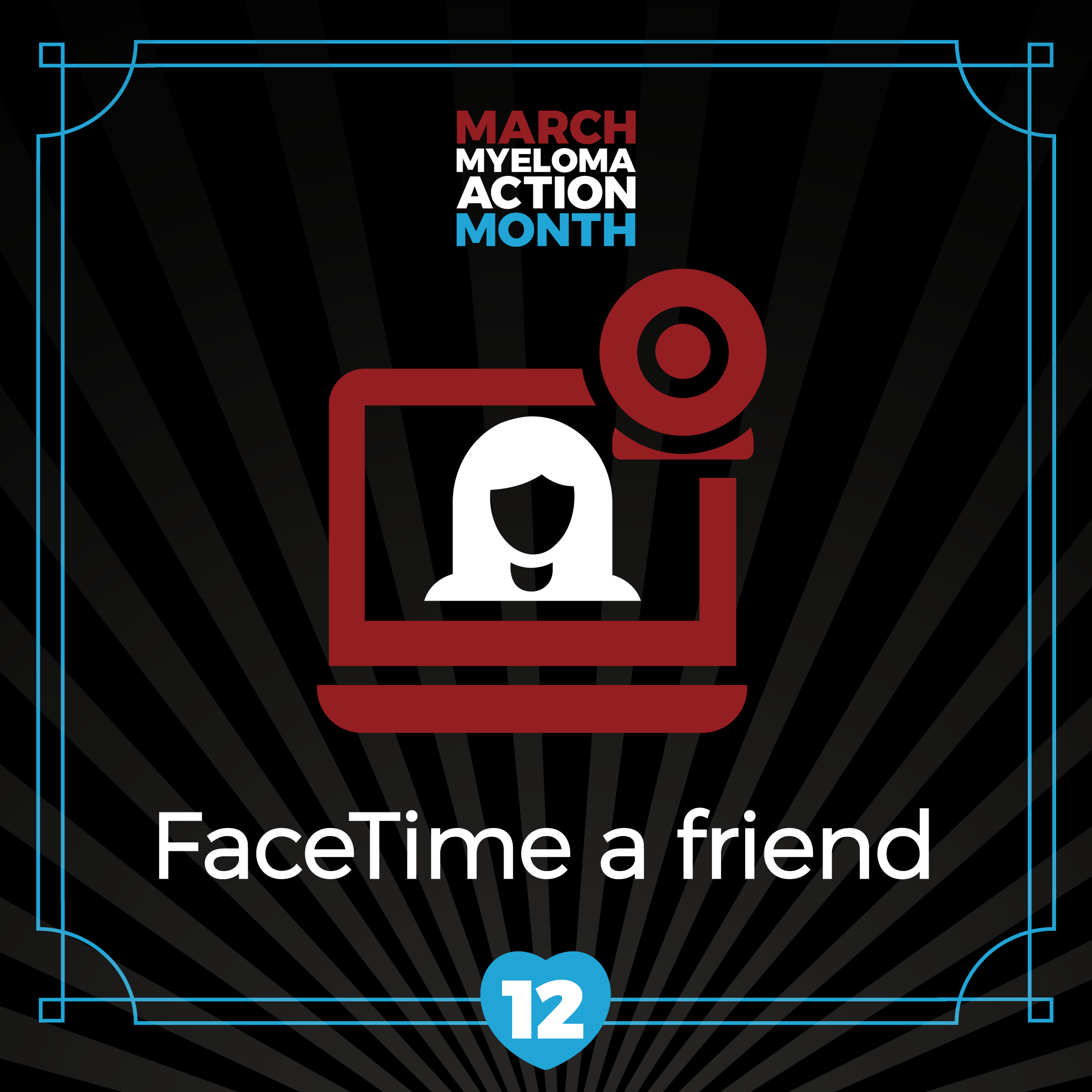





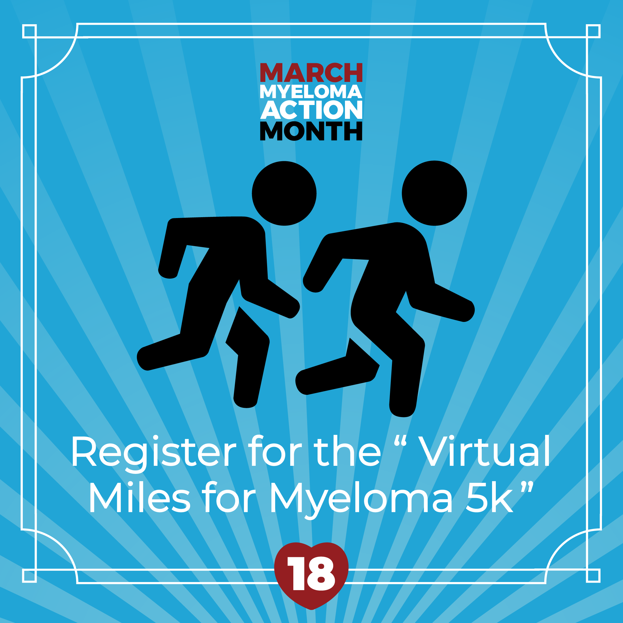





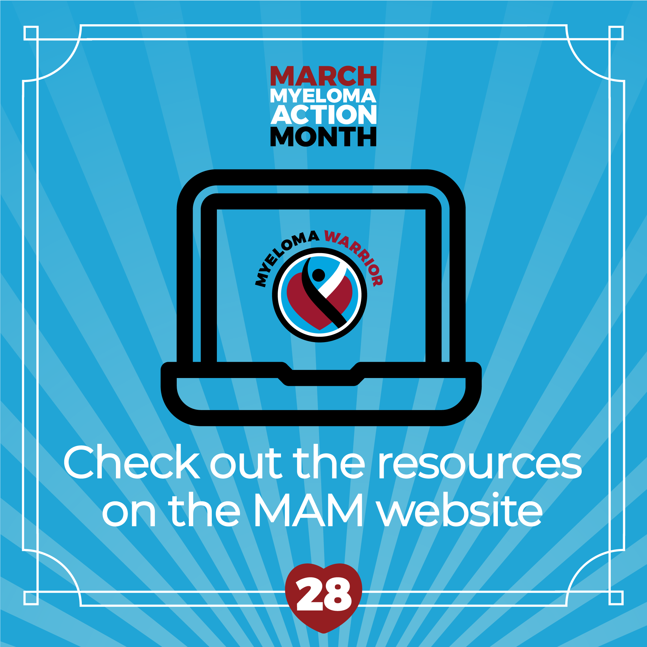
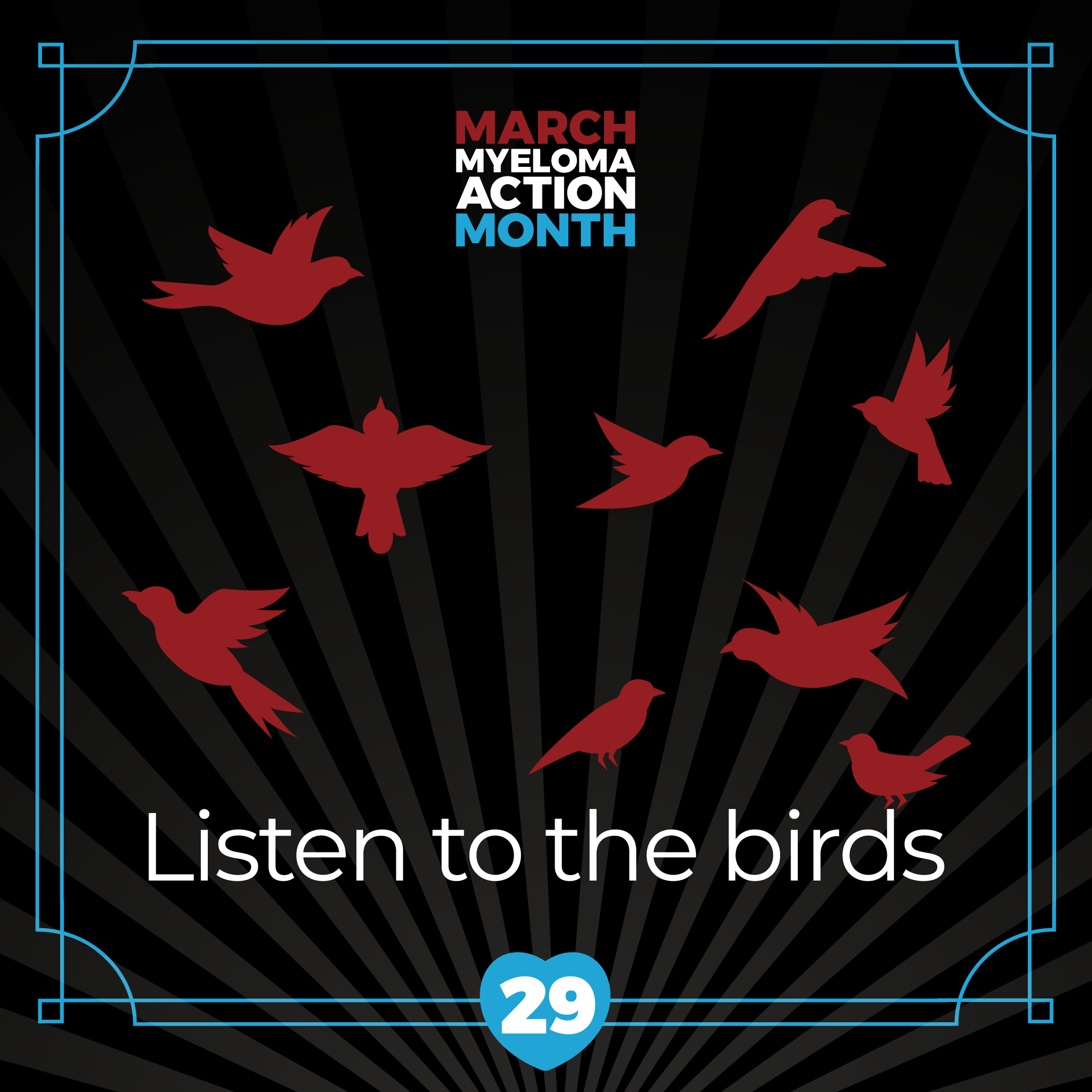

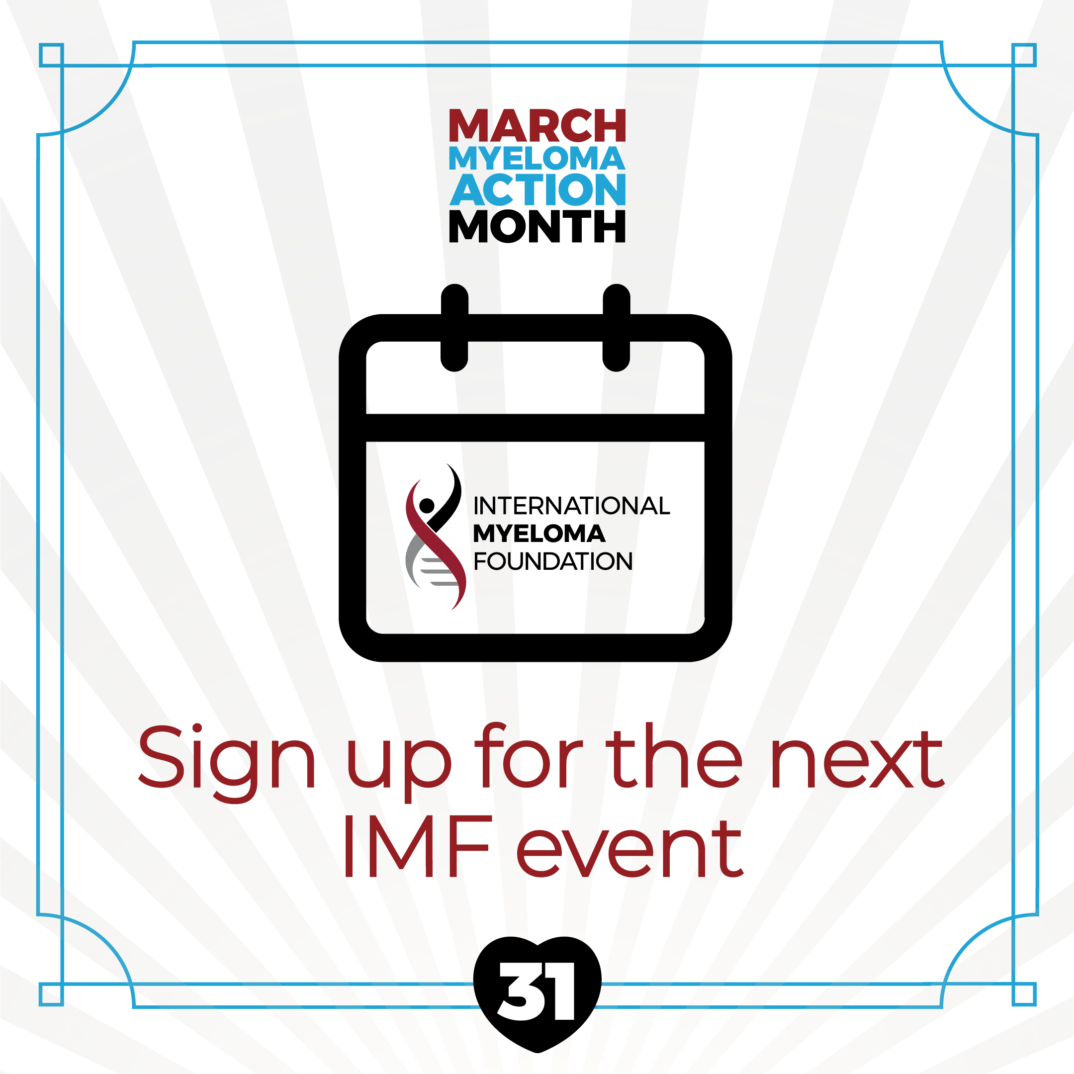
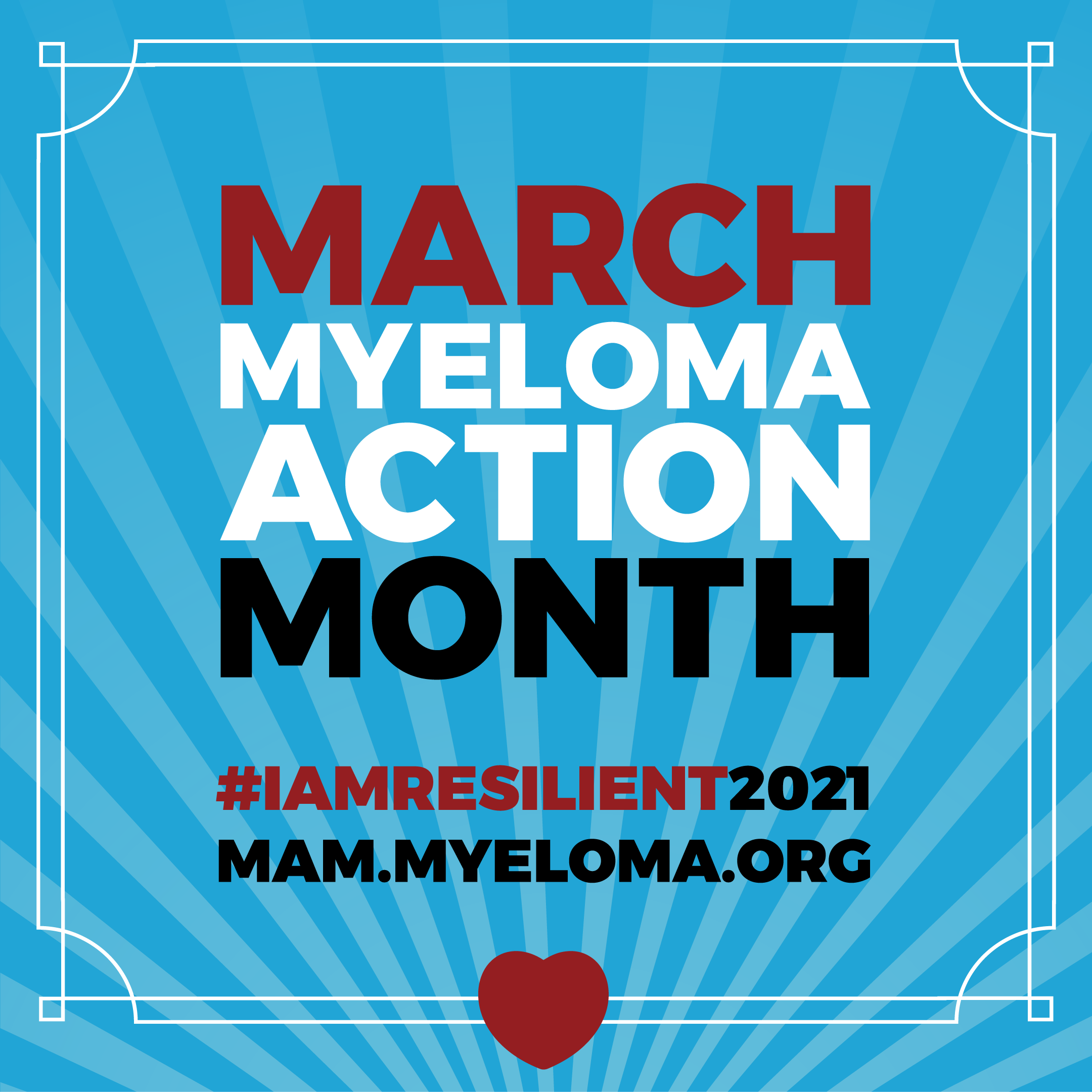
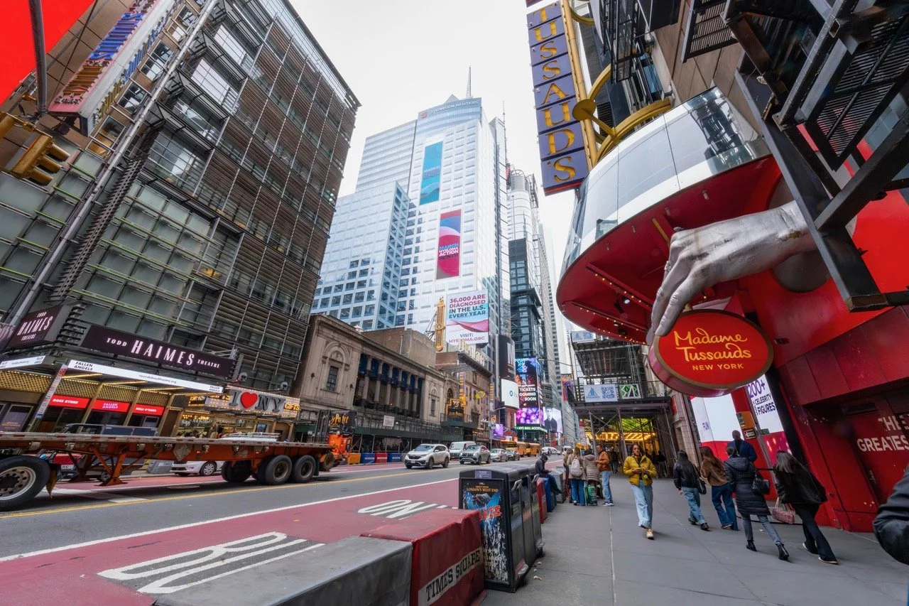
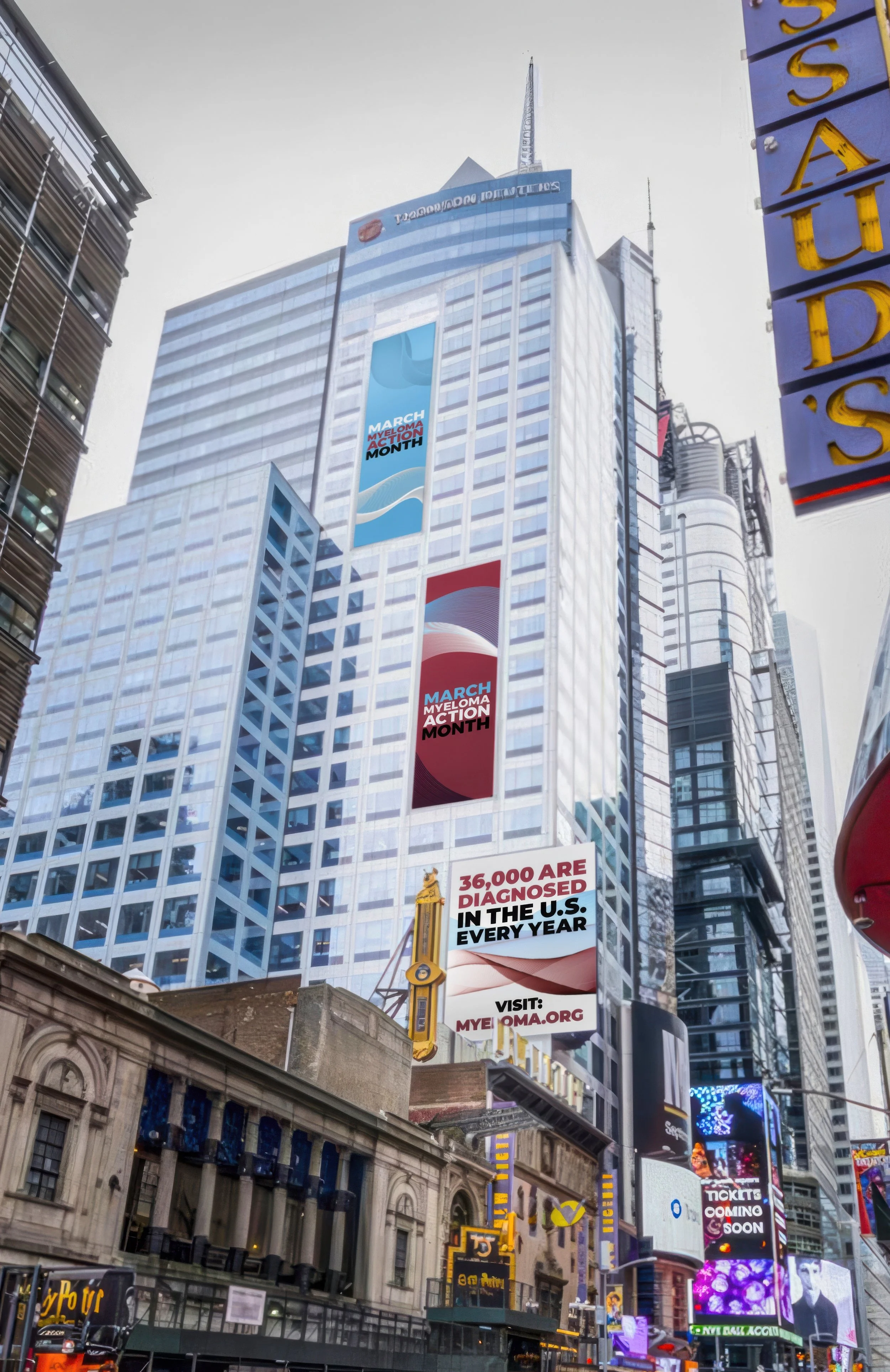
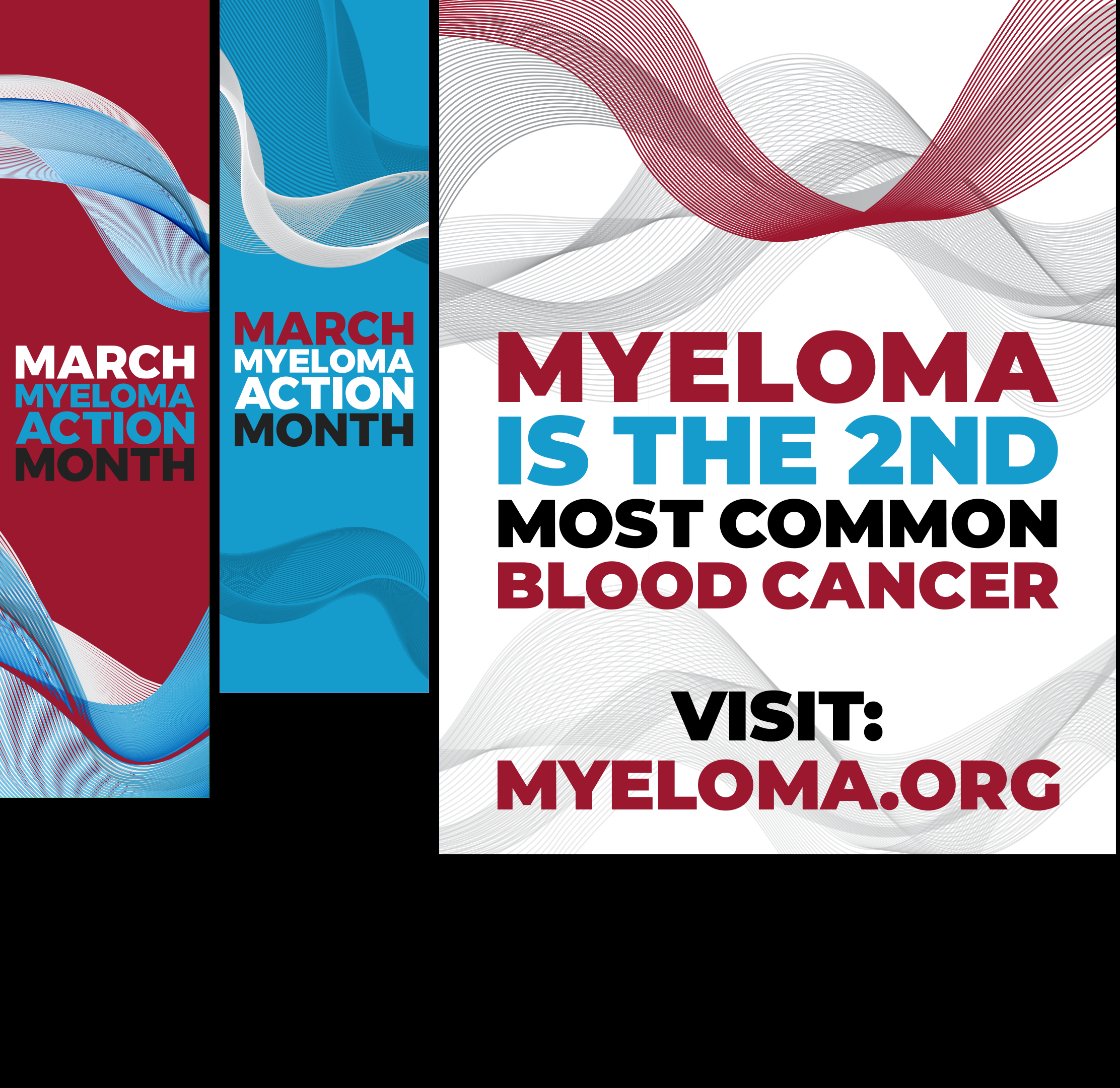
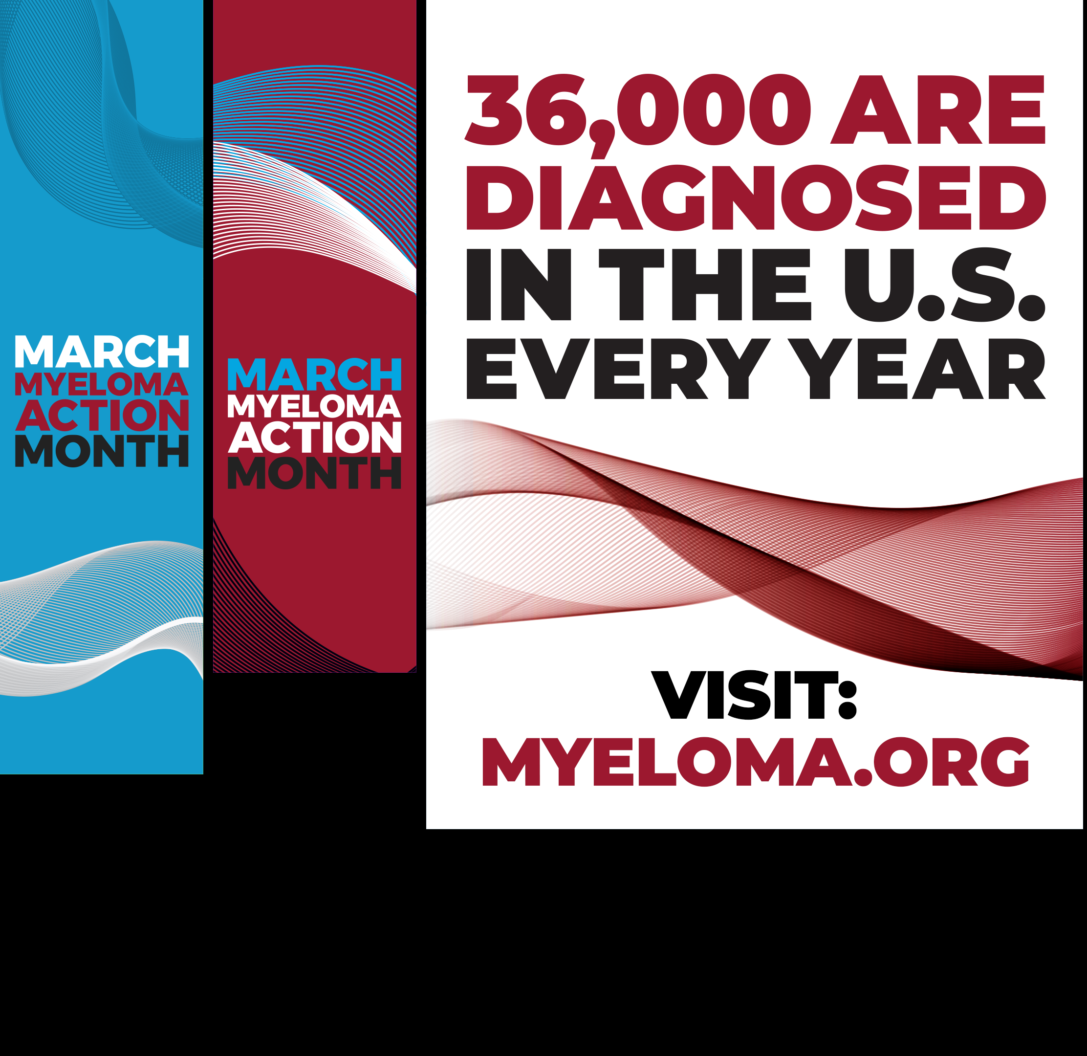
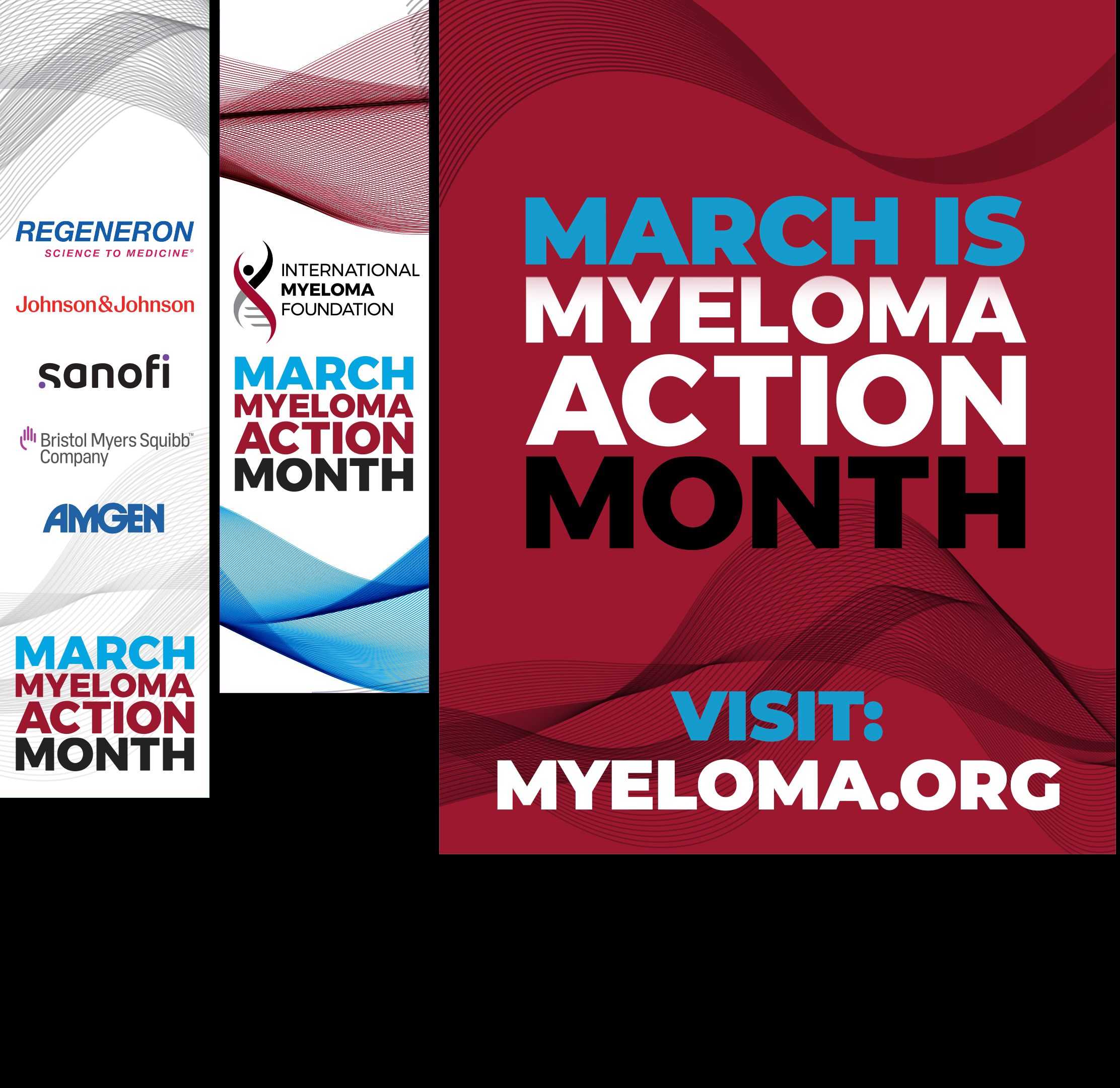
MAM - Myeloma Action Month - #MoreThanMyeloma Times Square and Social Media Campaign
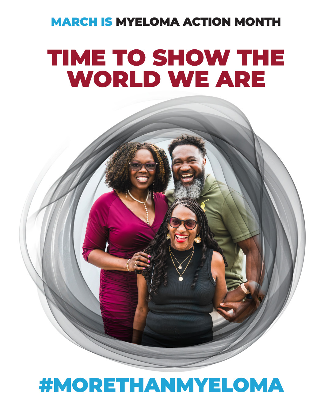
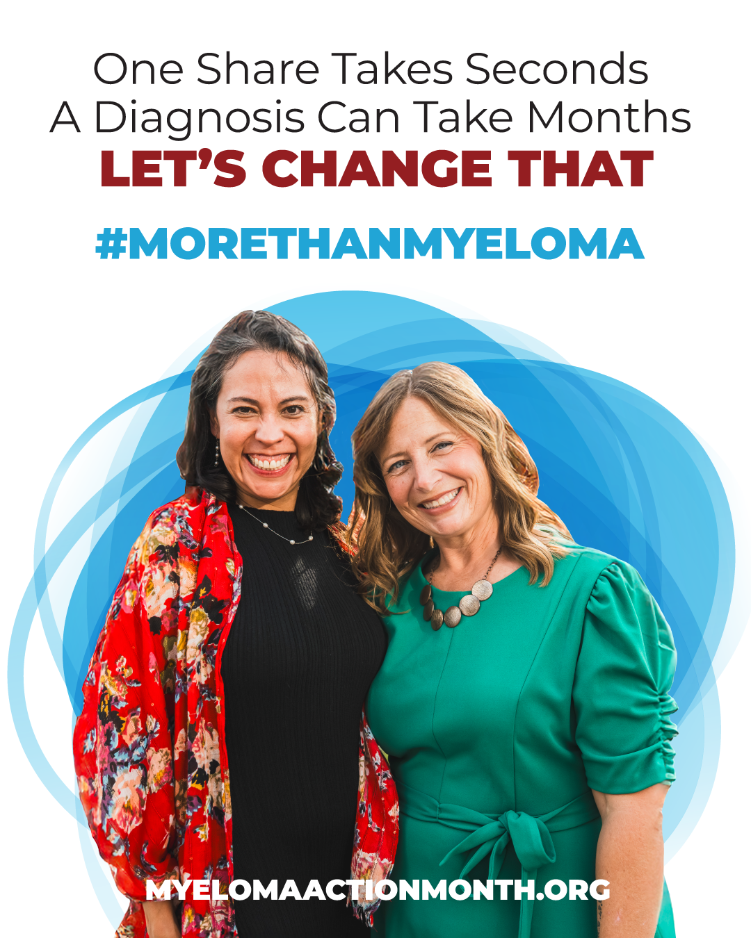
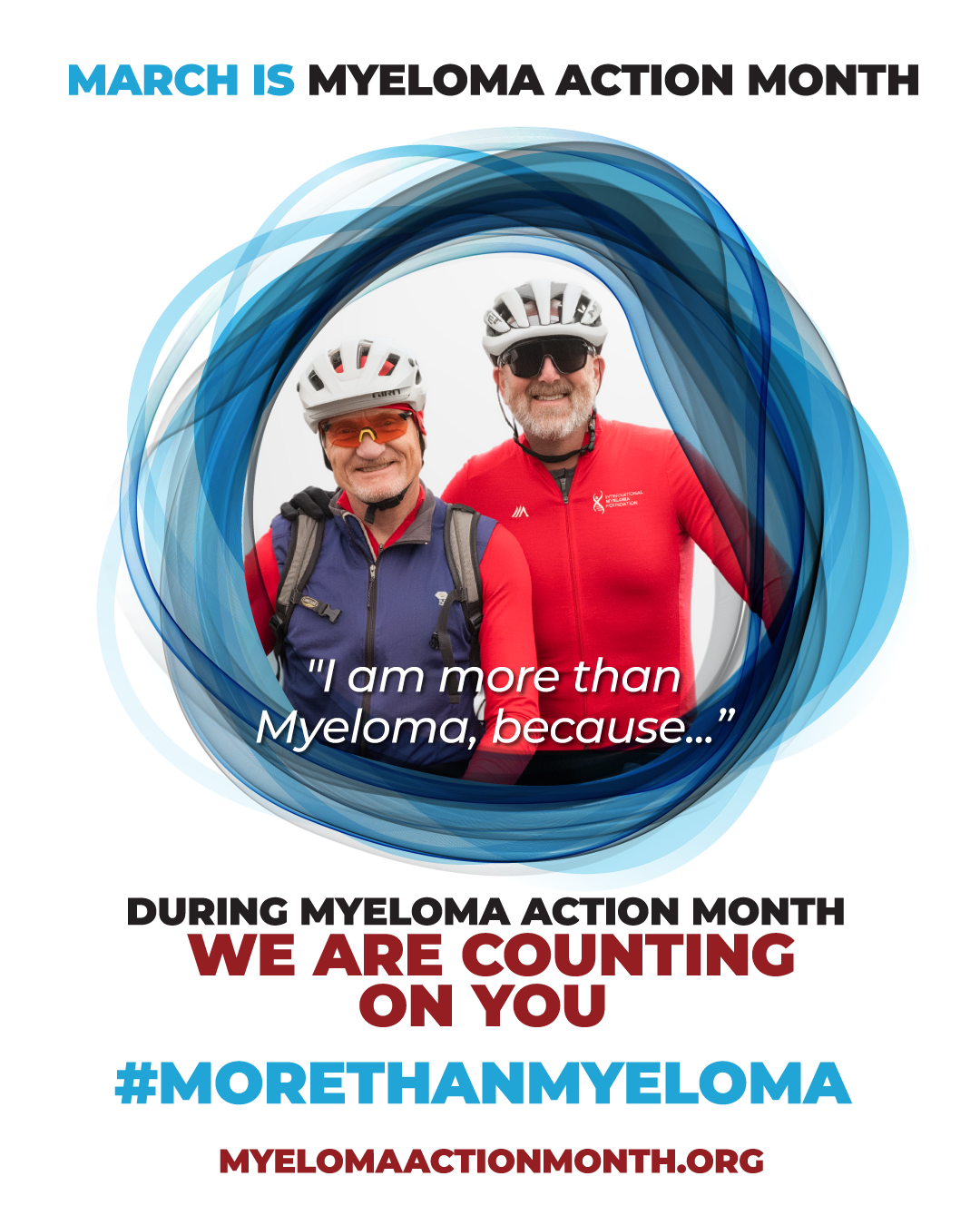
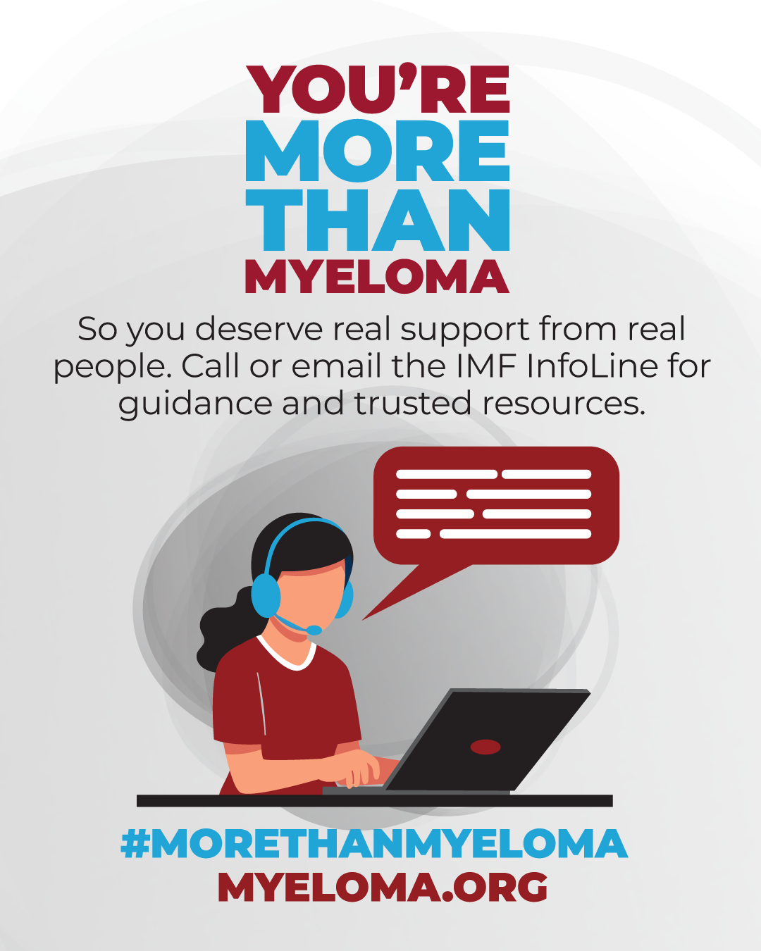
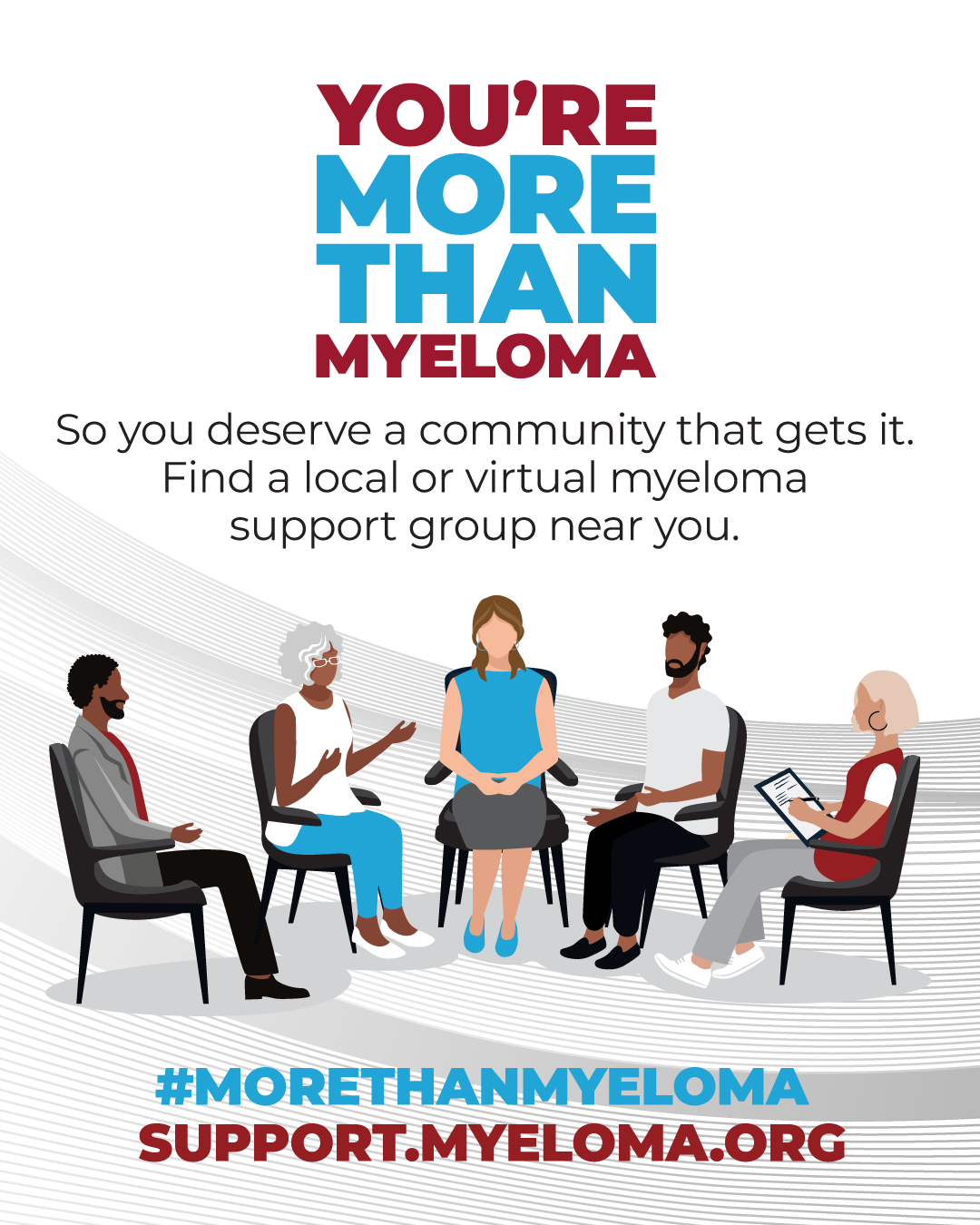
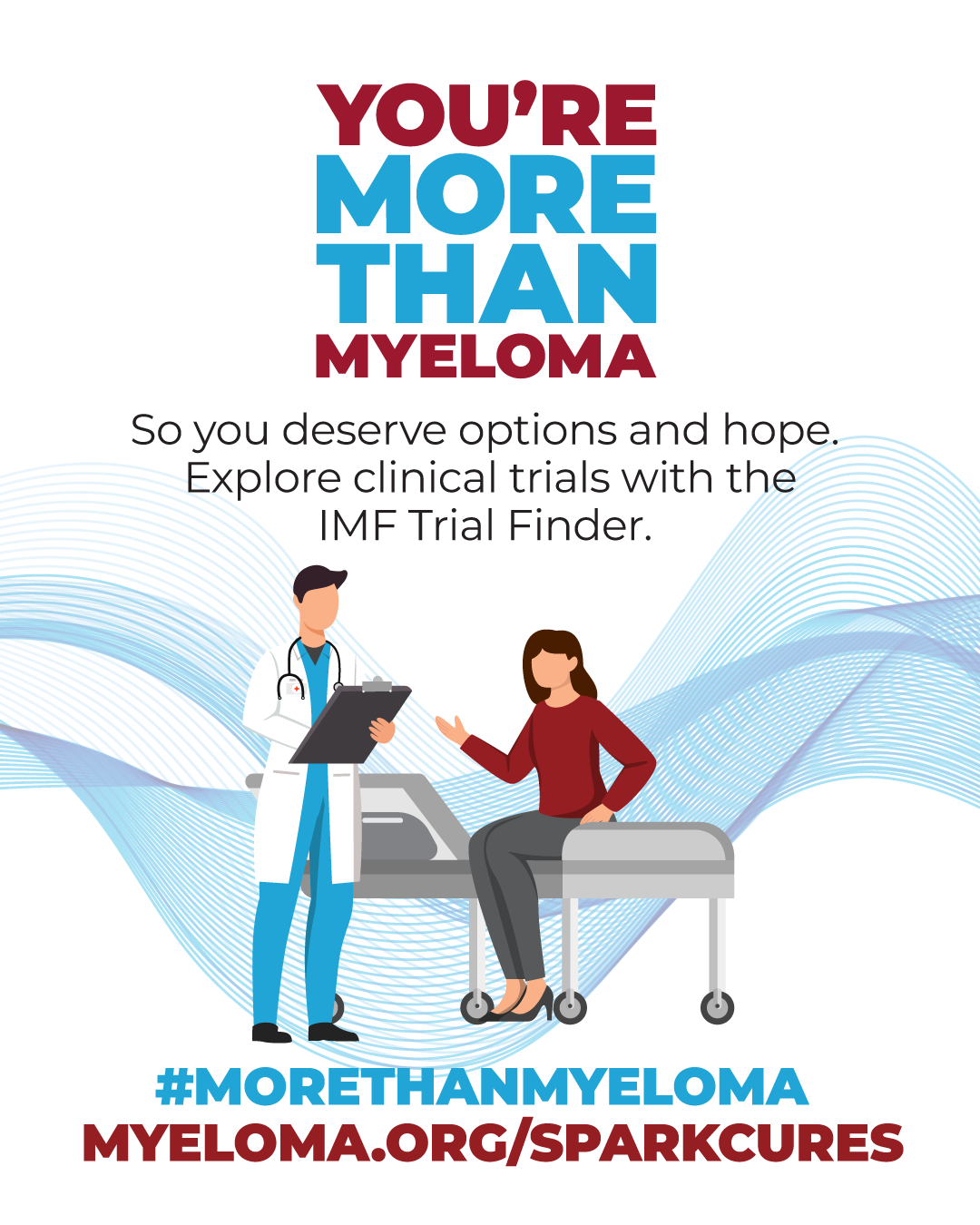
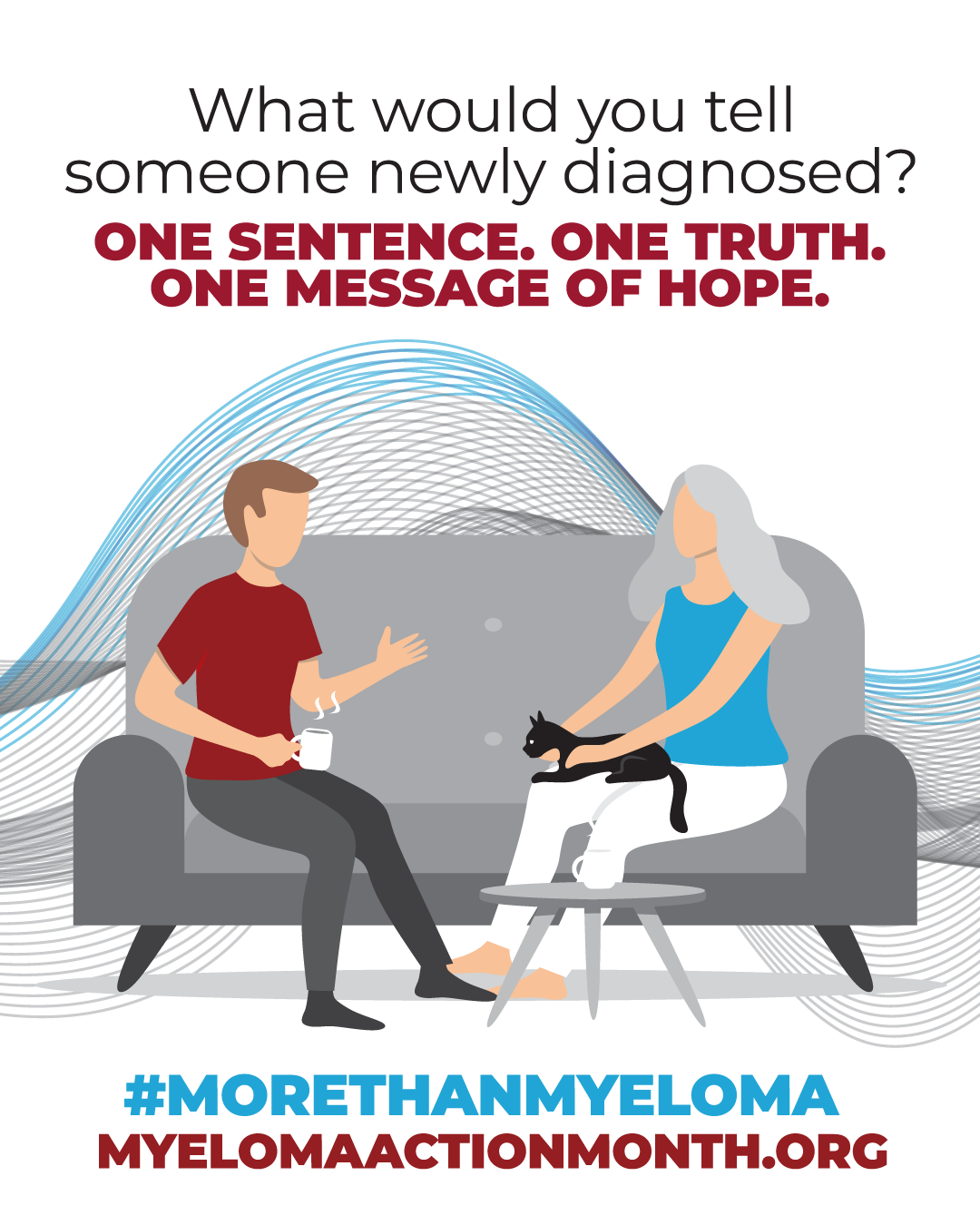
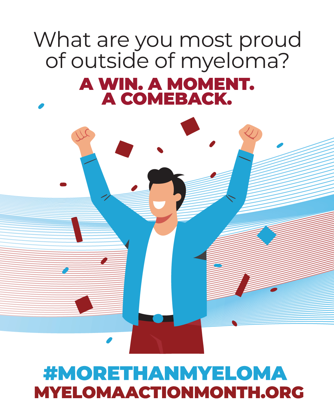
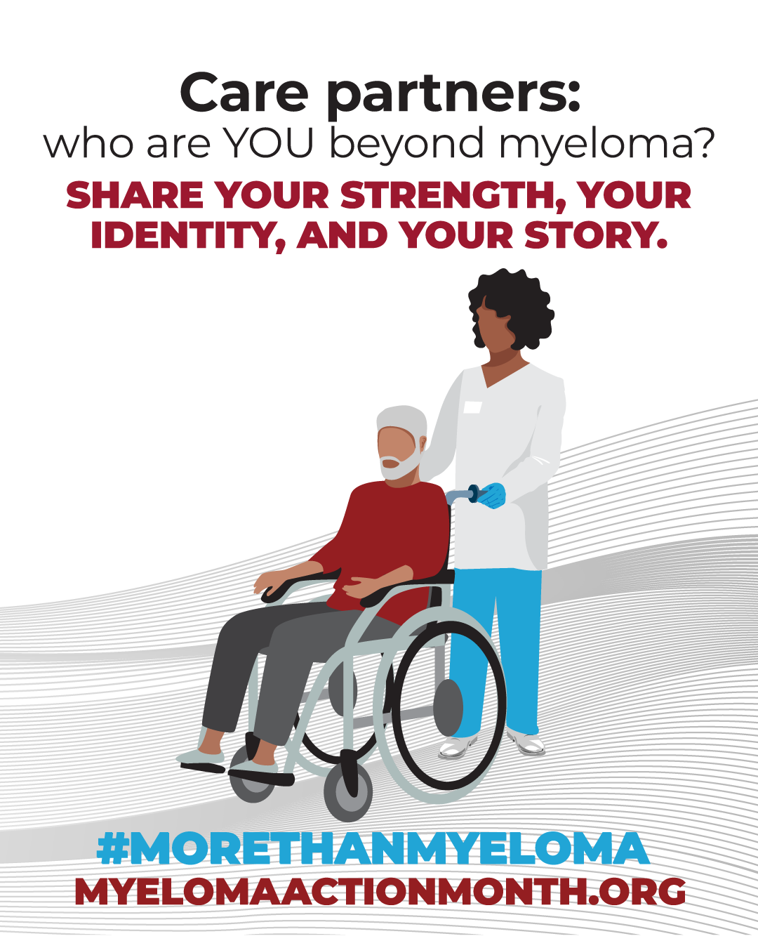
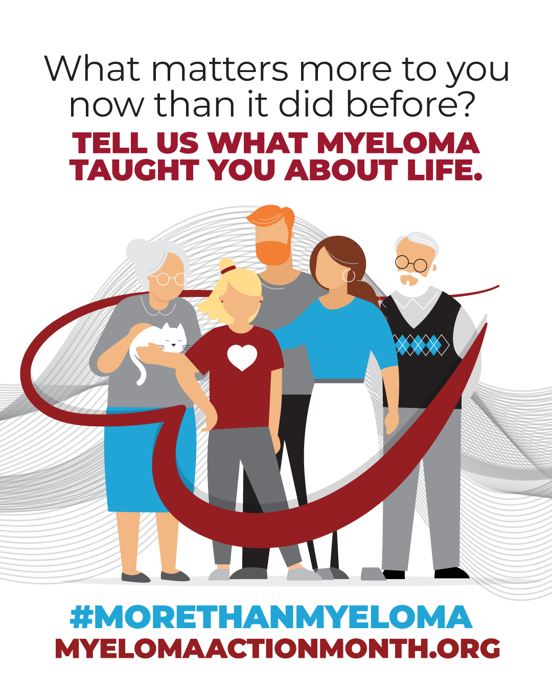
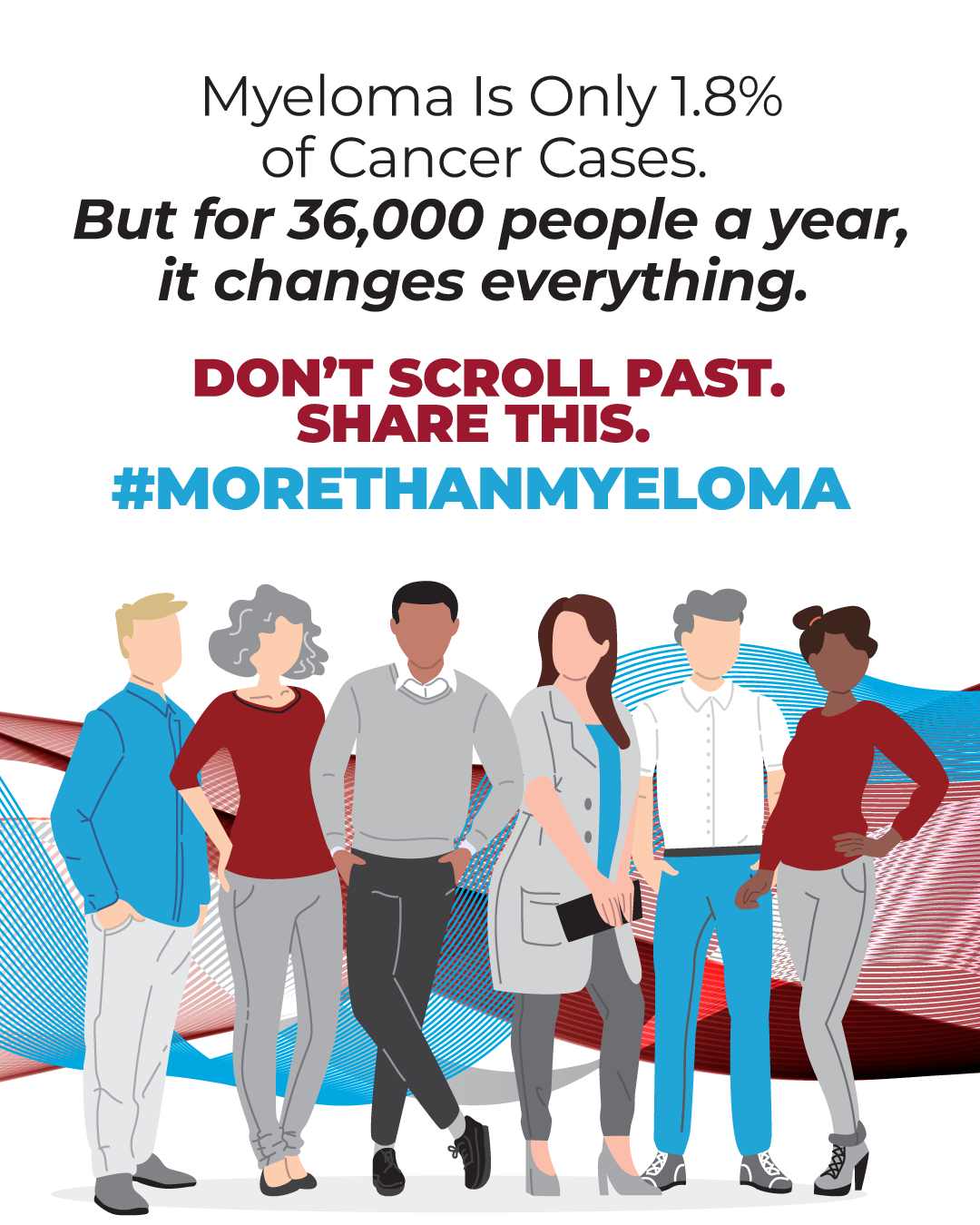
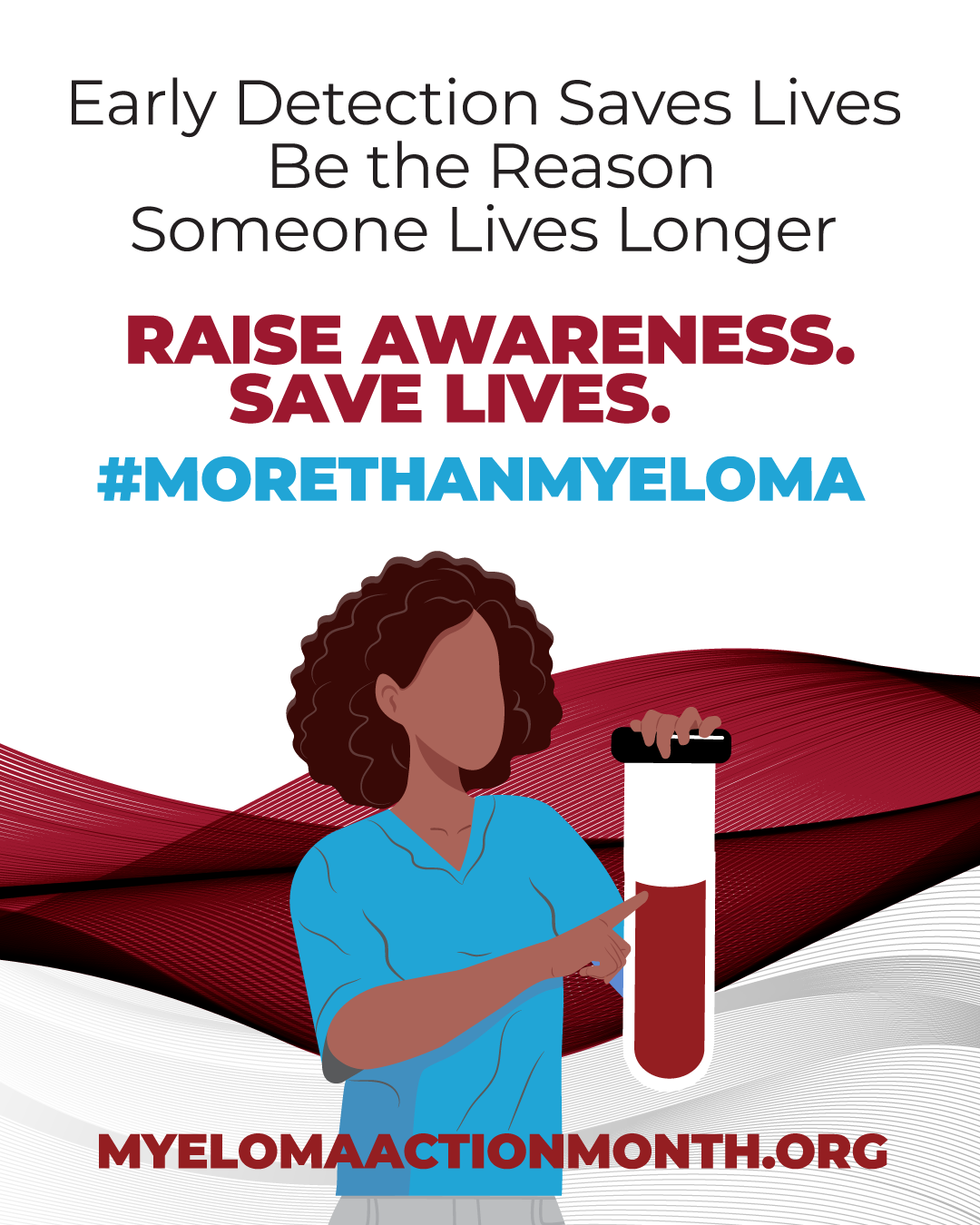
Print Design
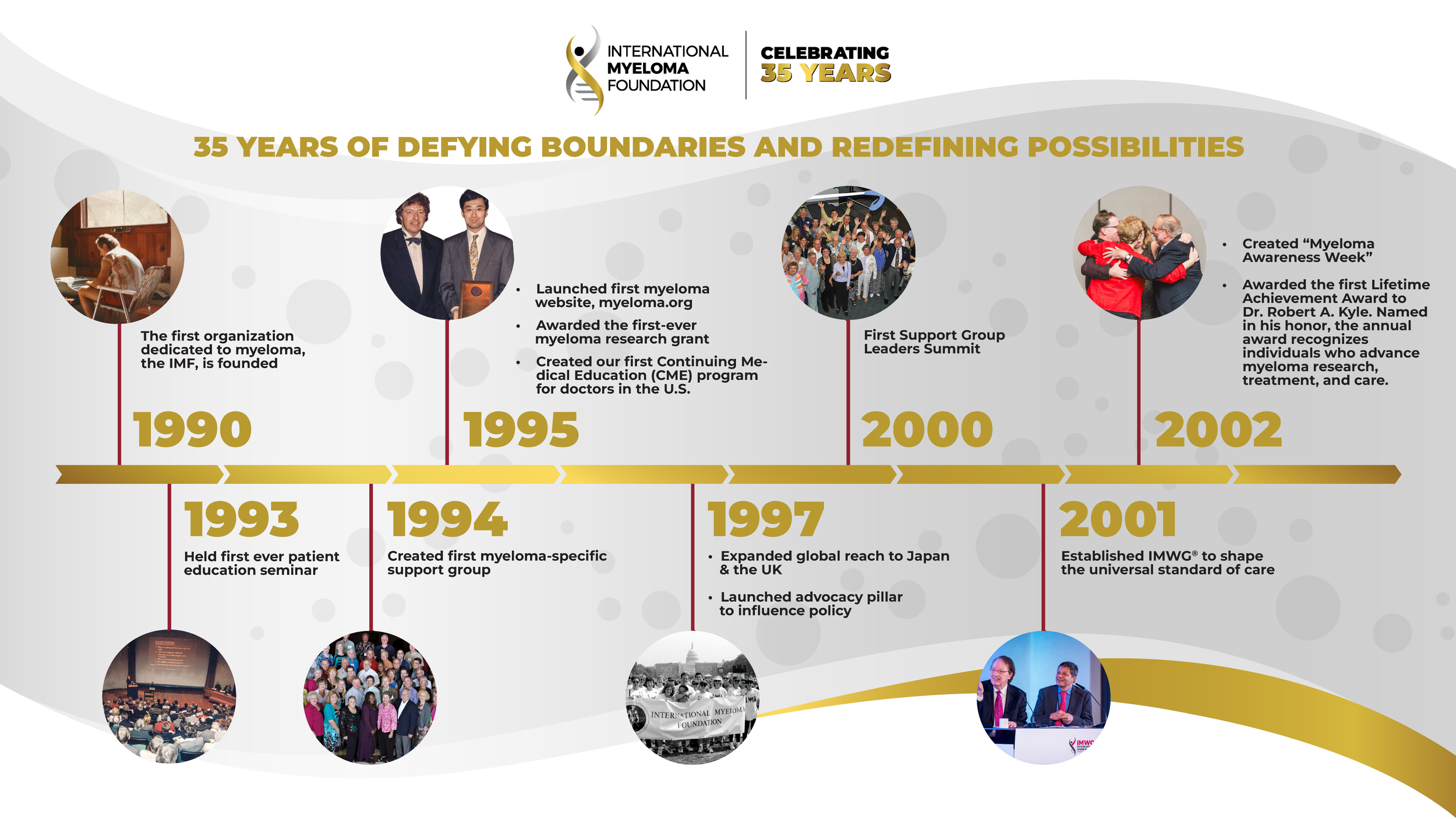
35th Anniversary Branding