The Redondo Beach Pier
A CASE STUDY
Brand Strategy · Corporate Identity · Logo Design · Website Redesign · Signage · Environmental Graphics · Mural Design · Retail Branding · Ongoing Creative Direction
Waking a Sleeping Jewel
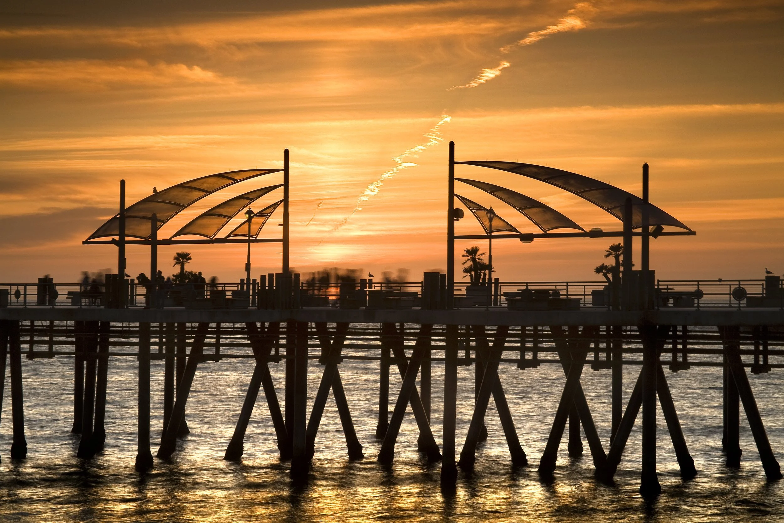
The Redondo Beach Pier has been a Southern California landmark for over a century, a place where families gather, tourists wander, and the Pacific sets the mood for everything. For years, it had been quietly fading. The buildings were worn. The energy was gone. The locals had drifted away.
Then came the Redondo Landing revitalization project, and with it, an opportunity to bring the Pier back to life. I was brought in at the beginning to make sure the brand matched the ambition.
The Challenge
The Pier was a sleeping jewel. People knew it existed, but it wasn’t a destination anyone felt compelled to visit. Years of neglect had taken their toll — on the physical space, on the reputation, and on the community’s relationship with a place that should have been a source of local pride.
The revitalization project represented a significant civic and financial investment. New facades. New stores. A complete redesign of the property. For that investment to pay off, the brand needed to do its part, creating a visual identity and marketing presence worthy of what the Pier was becoming, and compelling enough to bring families back.
The Work
I joined as Creative Director for the full rebrand, starting with the Pier’s corporate identity and extending outward to touch every corner of the property.
Corporate Identity & Logo
The Redondo Pier received a fresh start, a new logo and visual identity system built to anchor the revitalization and carry the Pier confidently into its next chapter. Clean, coastal, timeless.
Website Redesign
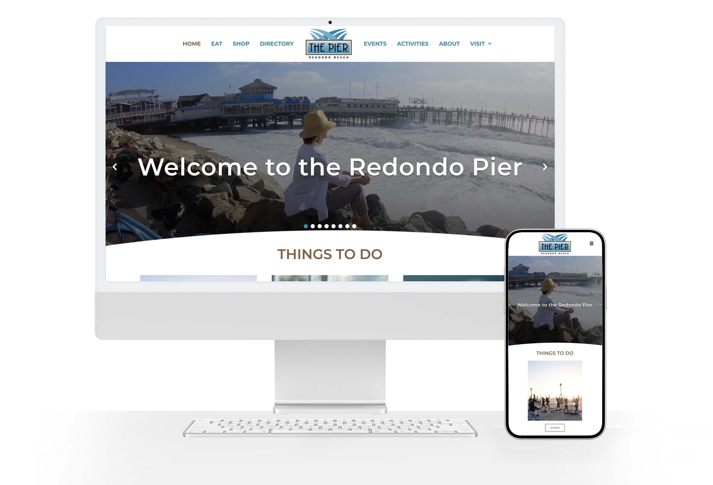
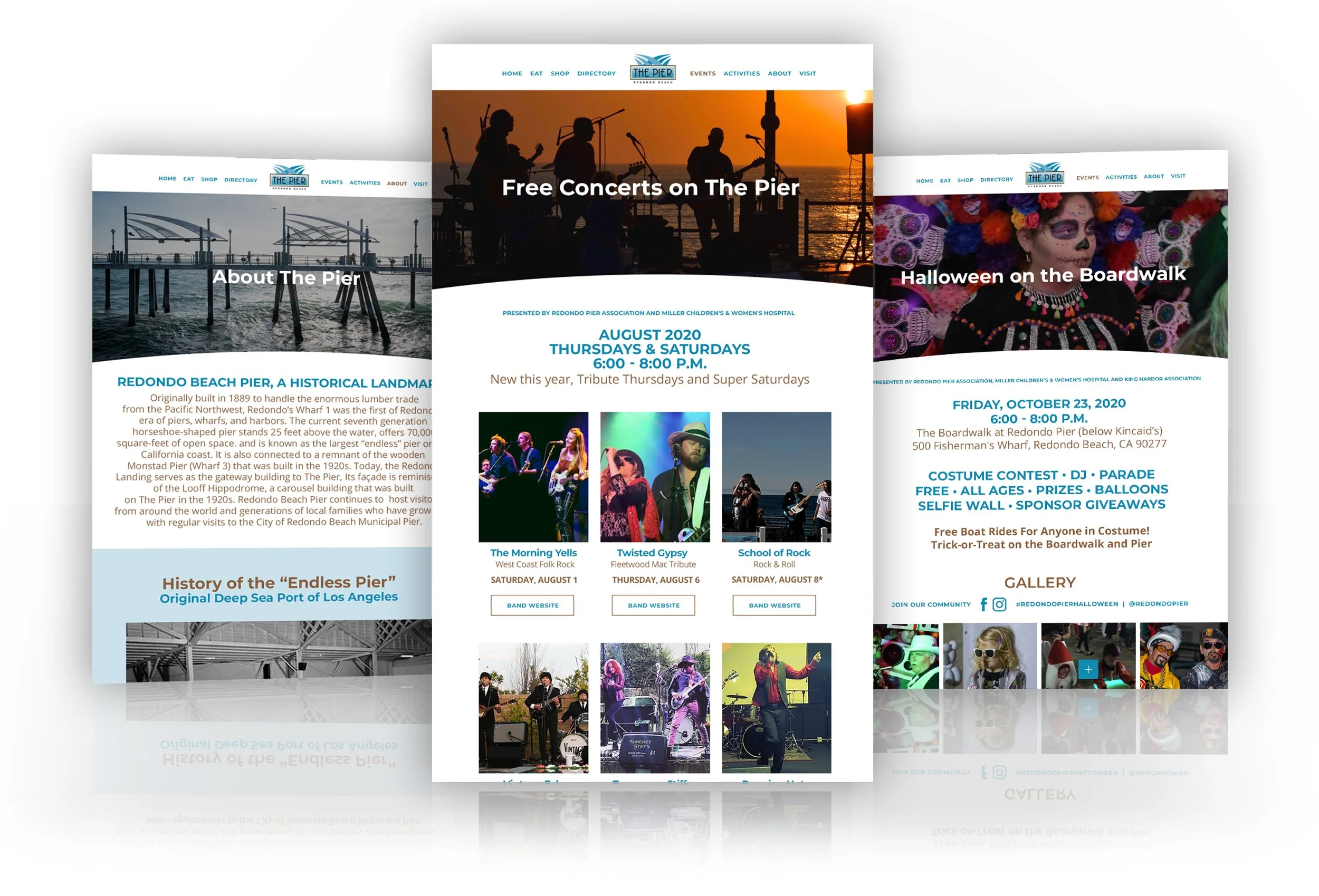
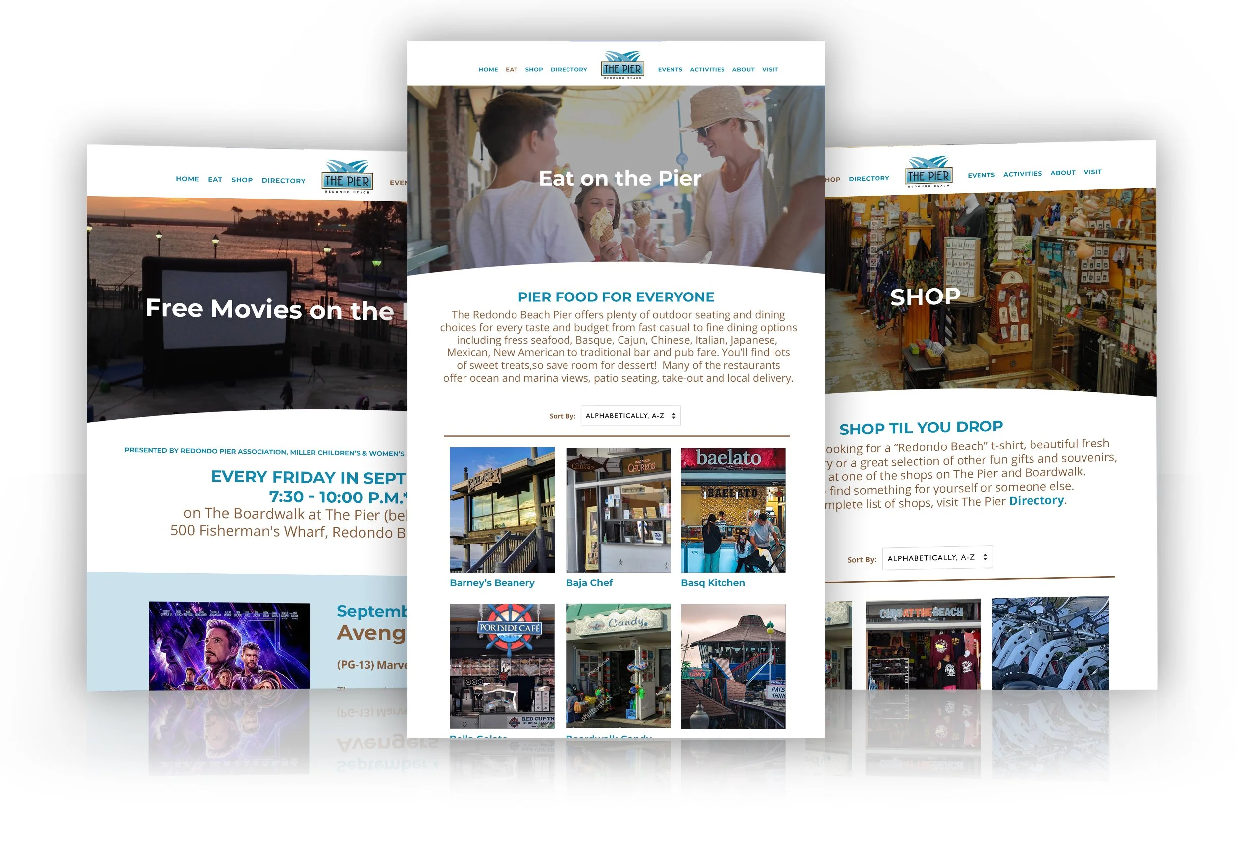
We redesigned and rearchitected the Redondo Pier website, creating an online destination experience that matched the elevated feel of the physical space, with clear visitor information, event features, and tenant directories.
Historical Murals
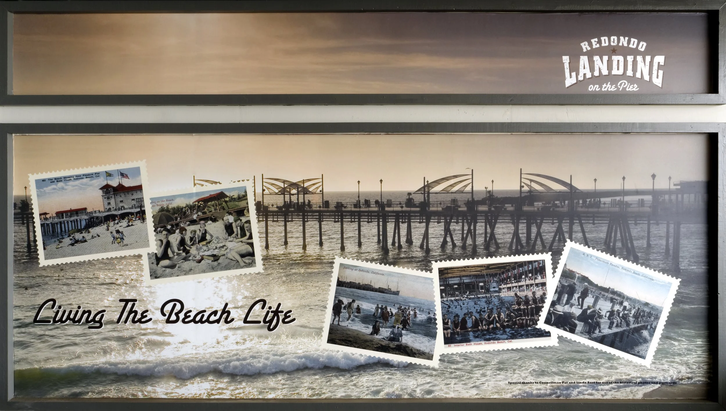
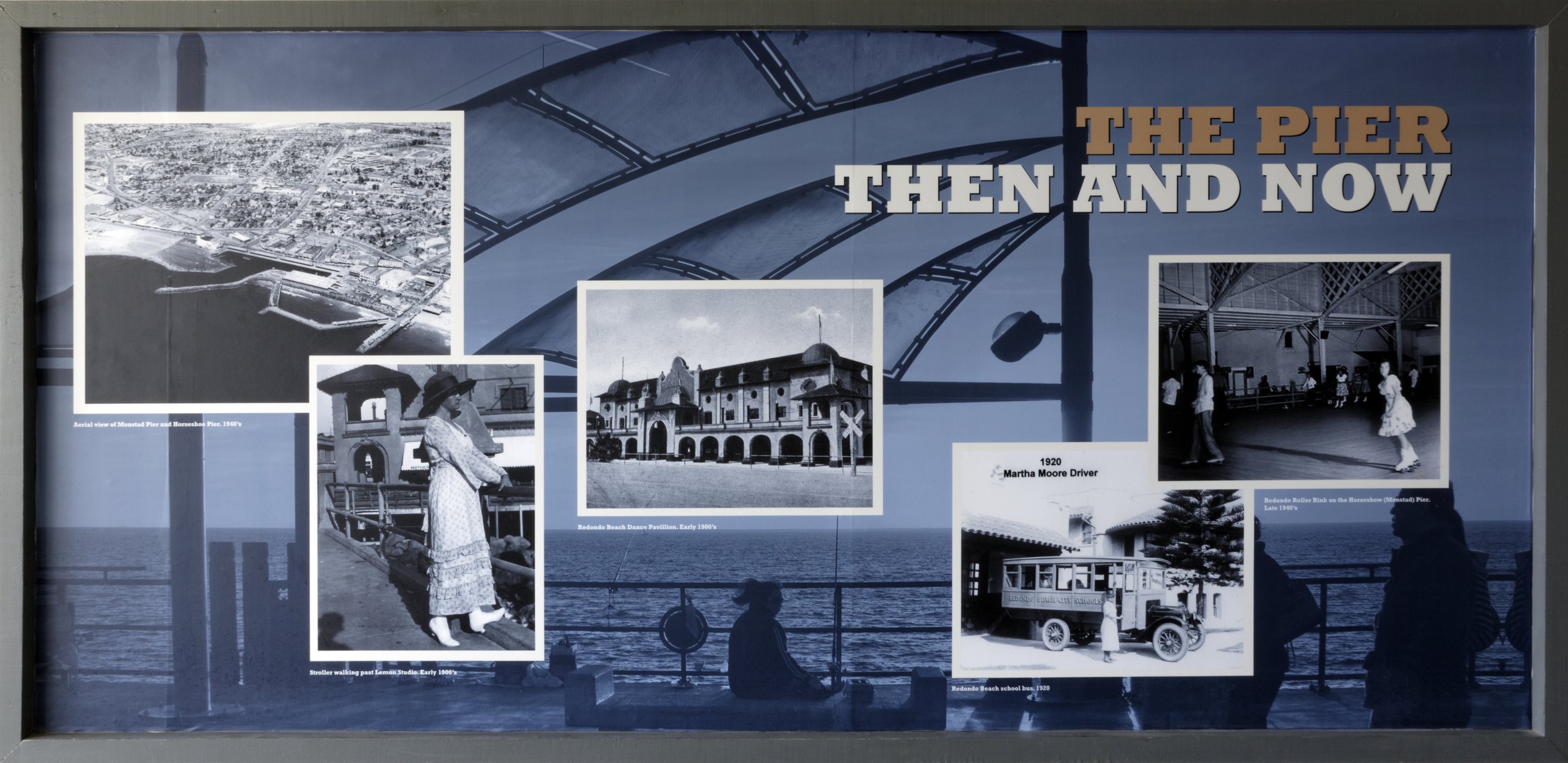
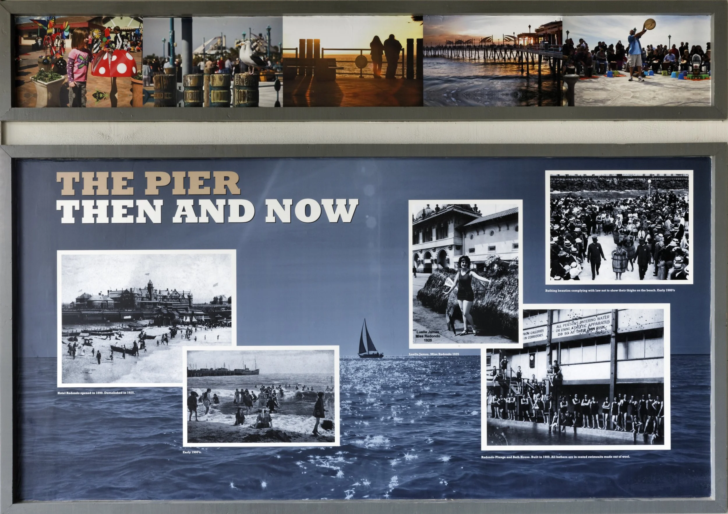
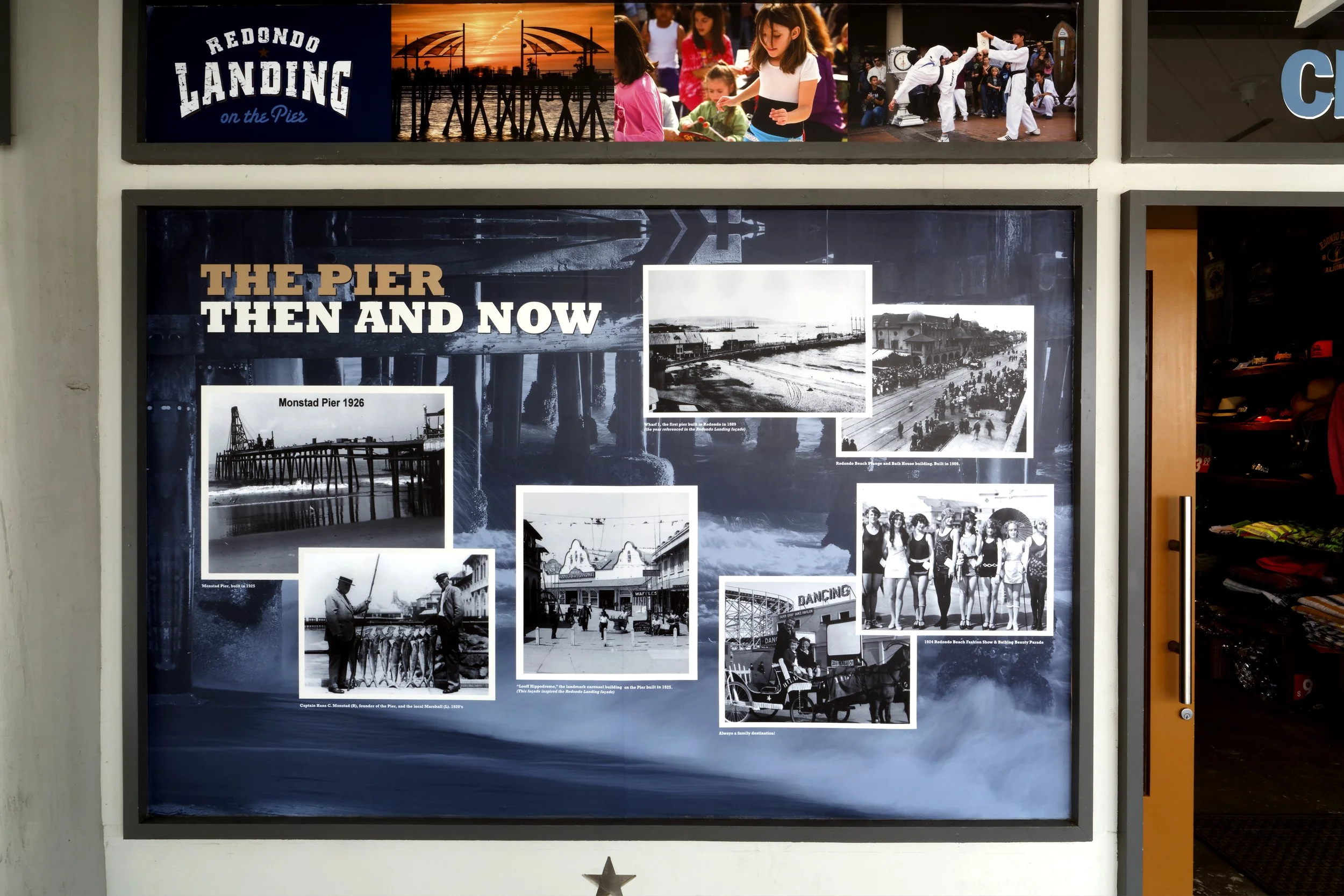
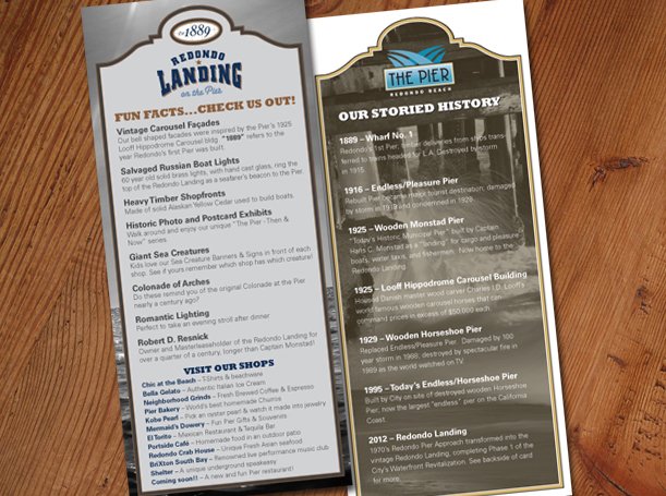
Working with the property owner, I designed a series of historical outdoor murals for the common areas, celebrating the Pier’s century-long story and giving visitors a sense of place, history, and community pride the moment they arrived.
Redondo Landing — Storefront Rebranding
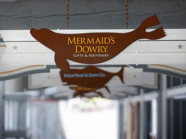
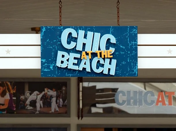
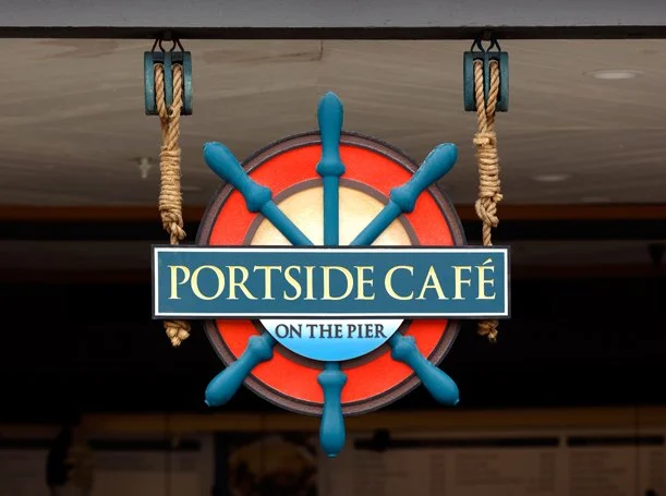
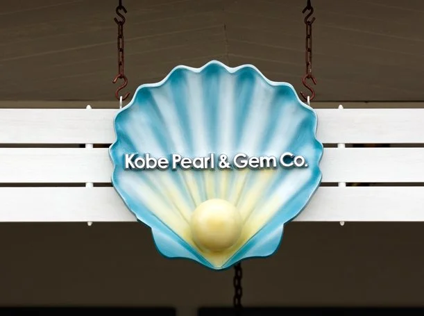
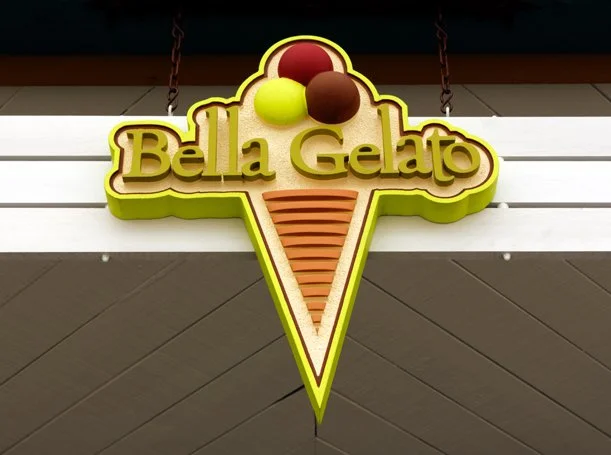
This was the most expansive part of the engagement. Every storefront in the Redondo Landing revitalization required a new corporate identity and new signage, each one distinct, each one cohesive with the larger Pier aesthetic. The storefronts included:
The Redondo Beach Crab House
Portside Café
Mermaid’s Dowry
Chic at the Beach
Kobe Pearl
Pier Bakery
Bella Gelato
Baelato
Eight businesses. Eight identities. One cohesive waterfront destination.
Ongoing Brand Stewardship
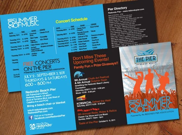
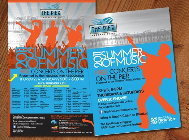
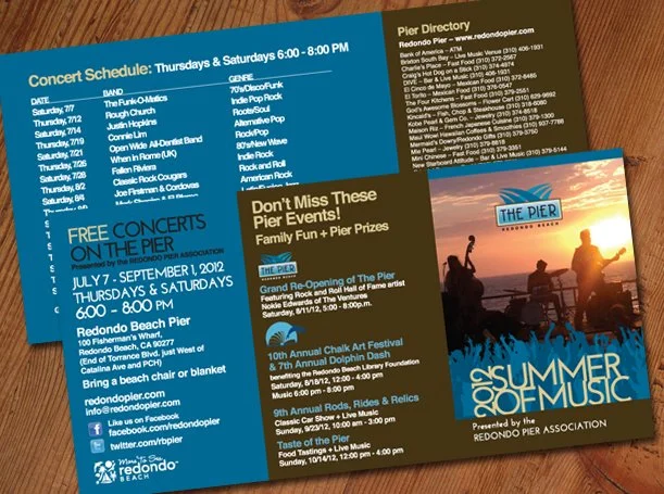
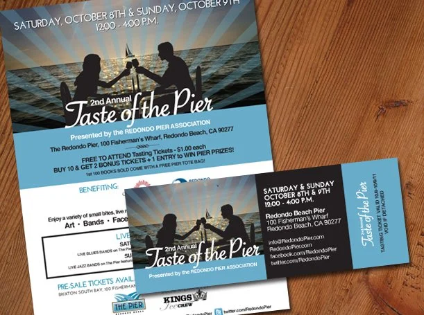
The Redondo Pier engagement didn’t end at launch. Since 2010 I have remained the Pier’s creative partner, redesigning and updating the website multiple times, creating ongoing marketing assets, seasonal banners, and campaign materials. When new tenants come in, I work with them to develop signage and branding that integrates seamlessly with the Pier’s overall aesthetic.
The Outcome
The revitalization was a hit. Beginning with the groundbreaking ceremony, the investment in the property — and in the brand — began to show. Locals came back. Tourists took notice. The Pier reclaimed its place as a thriving community destination and a point of South Bay pride. Today the Redondo Beach Pier is once again exactly what it should be, a landmark, a gathering place, and a brand that reflects the energy and warmth of the community it serves.
Branding, Logo Design

Website Design & Development
Outdoor Historical Pier Signage
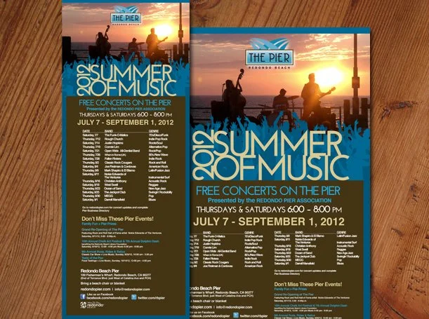
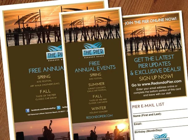
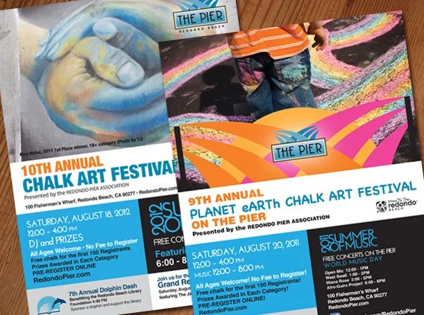
Print Collateral Design
Tenant Logos and Signage